Framer has become a popular choice for designers looking to build websites without code.
If you’re a Figma user, you’re already in a great place to start. Framer combines the design freedom of Figma with the power to create live, functional websites.
This guide will help you transition smoothly from Figma to Framer by covering key concepts, tools, and tips you need to know.
To Build in Framer or Start in Figma?
Should you design in Figma first or build directly in Framer? This is a common debate.
Here’s what I recommend:
- Start in Figma if you need flexibility to explore different design directions first.
- Build directly in Framer if your design direction is clear—this saves time.
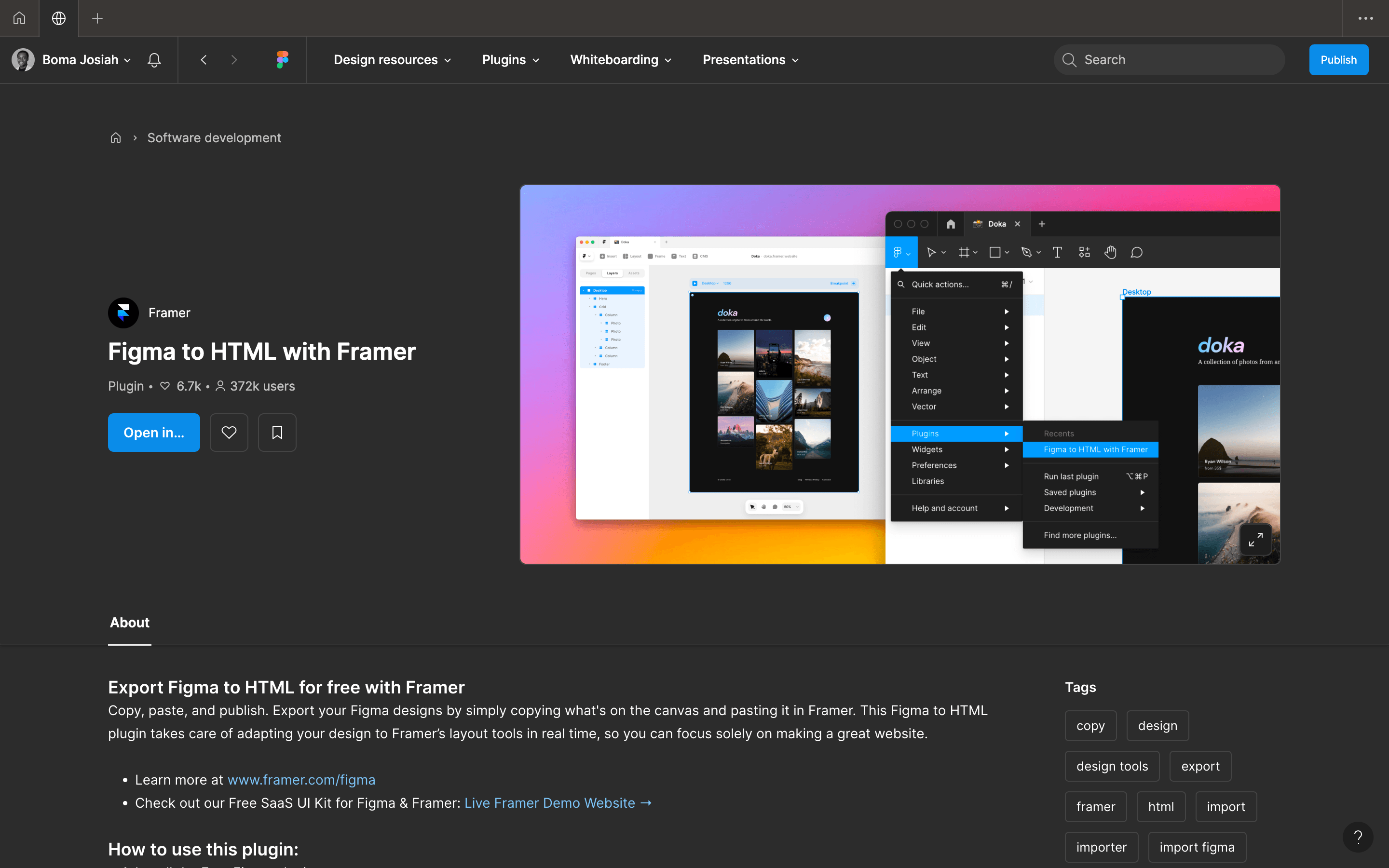
Pro Tip: Use Framer's Figma plugin to copy and paste your designs into Framer. For best results, copy in small chunks instead of the full design. If you’ve used auto-layout in Figma, Framer will recognize this and make it easier to work with layouts.
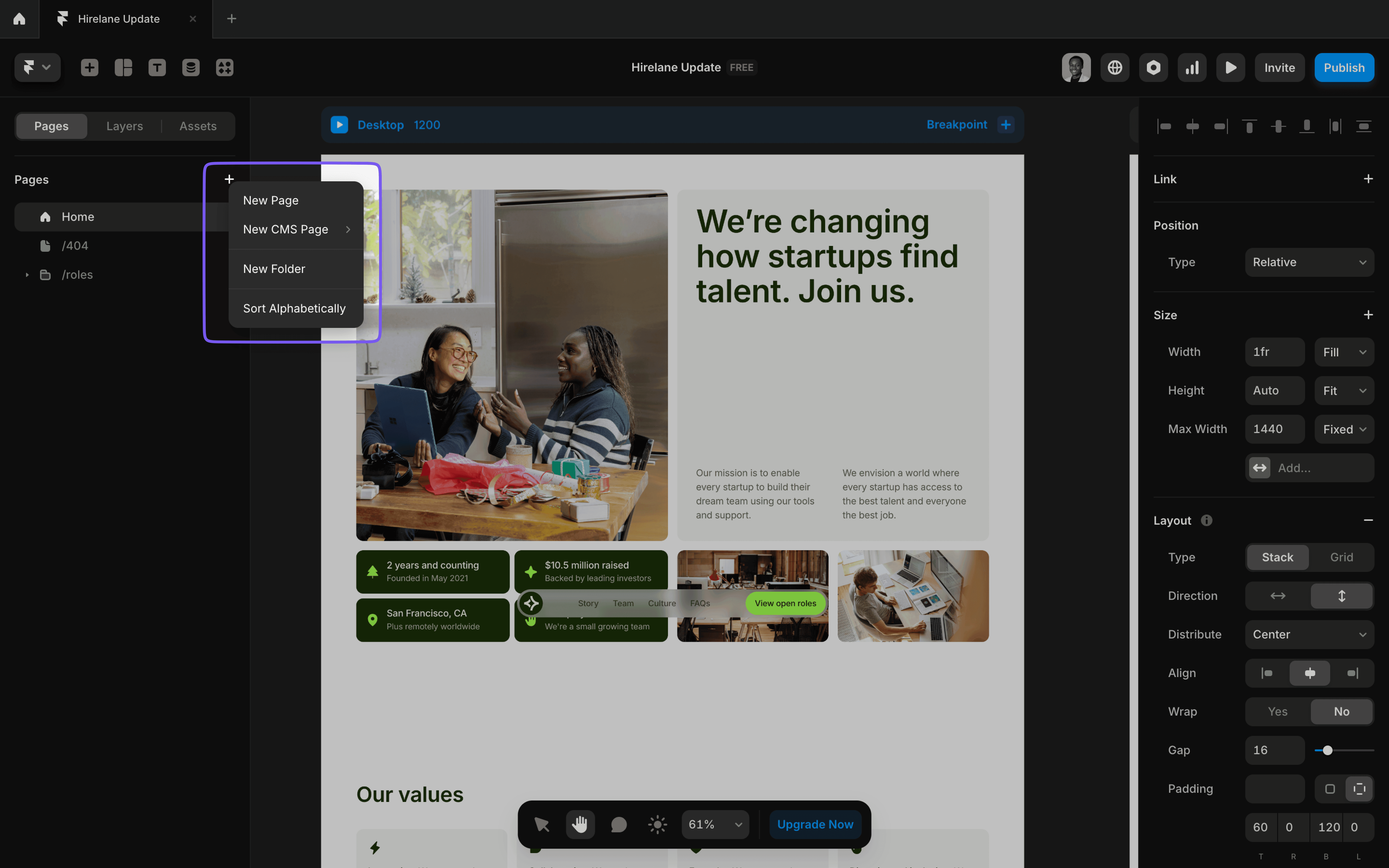
Pages and Layers
Just like Figma, Framer uses pages and layers to organize your work.
- Pages: Each page in Framer corresponds to an actual web page (e.g., Home, About, Contact).
- CMS Pages: Dynamic pages powered by Framer CMS.
- Folders: Group pages into folders for better organization.
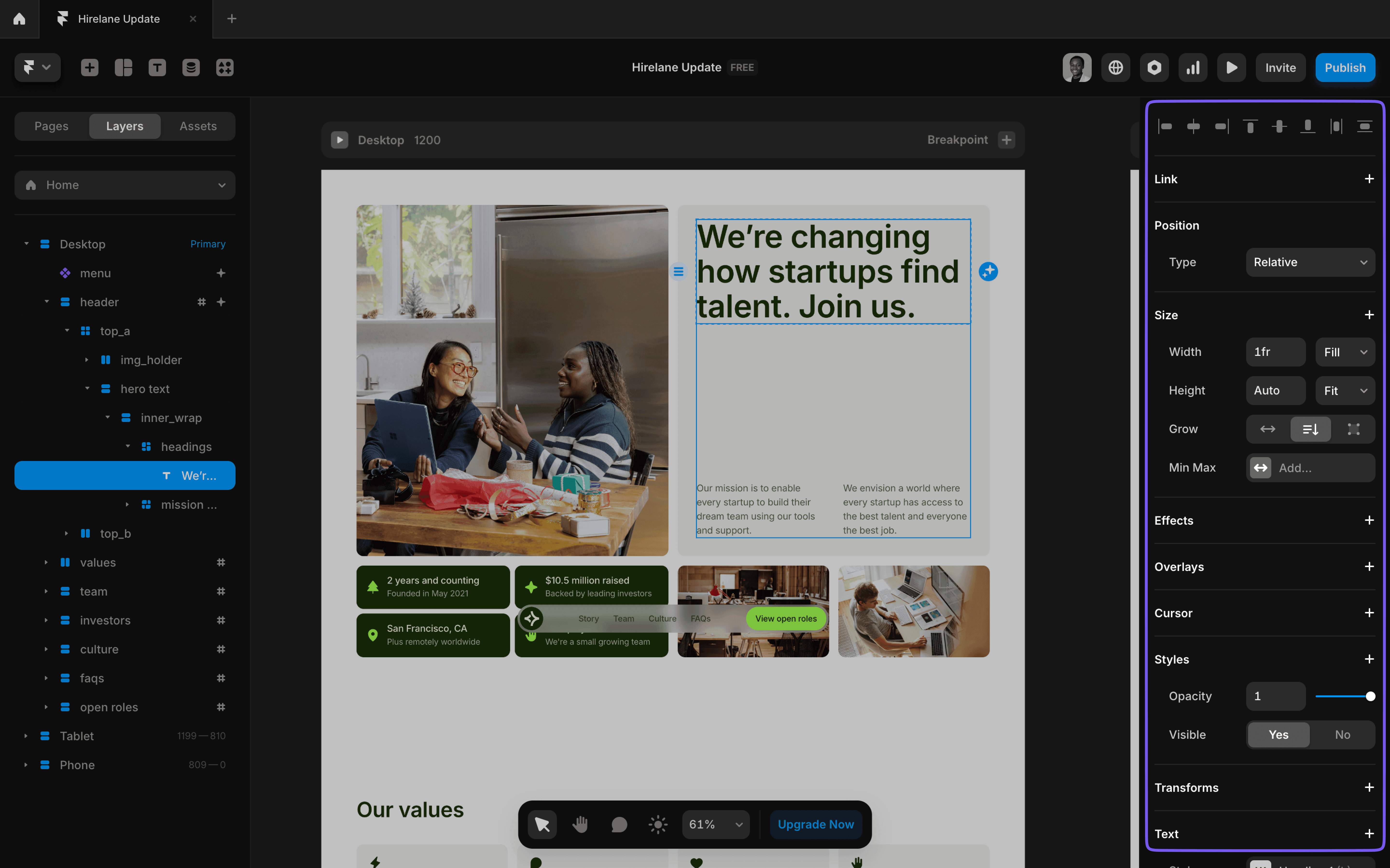
- Layers: Everything you add to the canvas appears in the layers panel. You can tweak settings in the Properties Panel—adjust layout, styles, effects, and more.
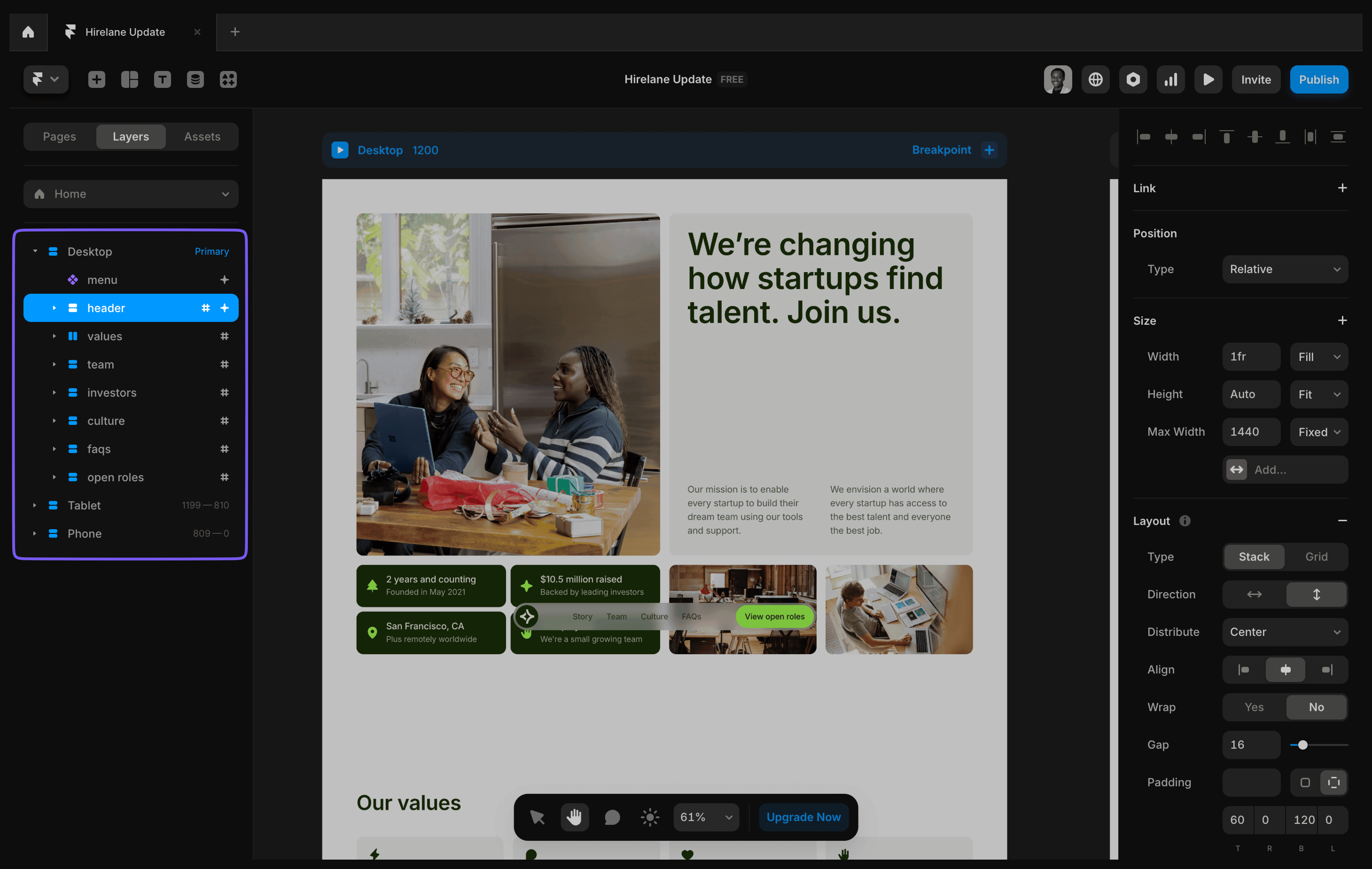
Properties Panel
The properties panel lets you fine-tune elements on your page. Select an element to access options for:
- Layout: Adjust alignment, direction, and spacing.
- Styles: Set colors, text, and effects.
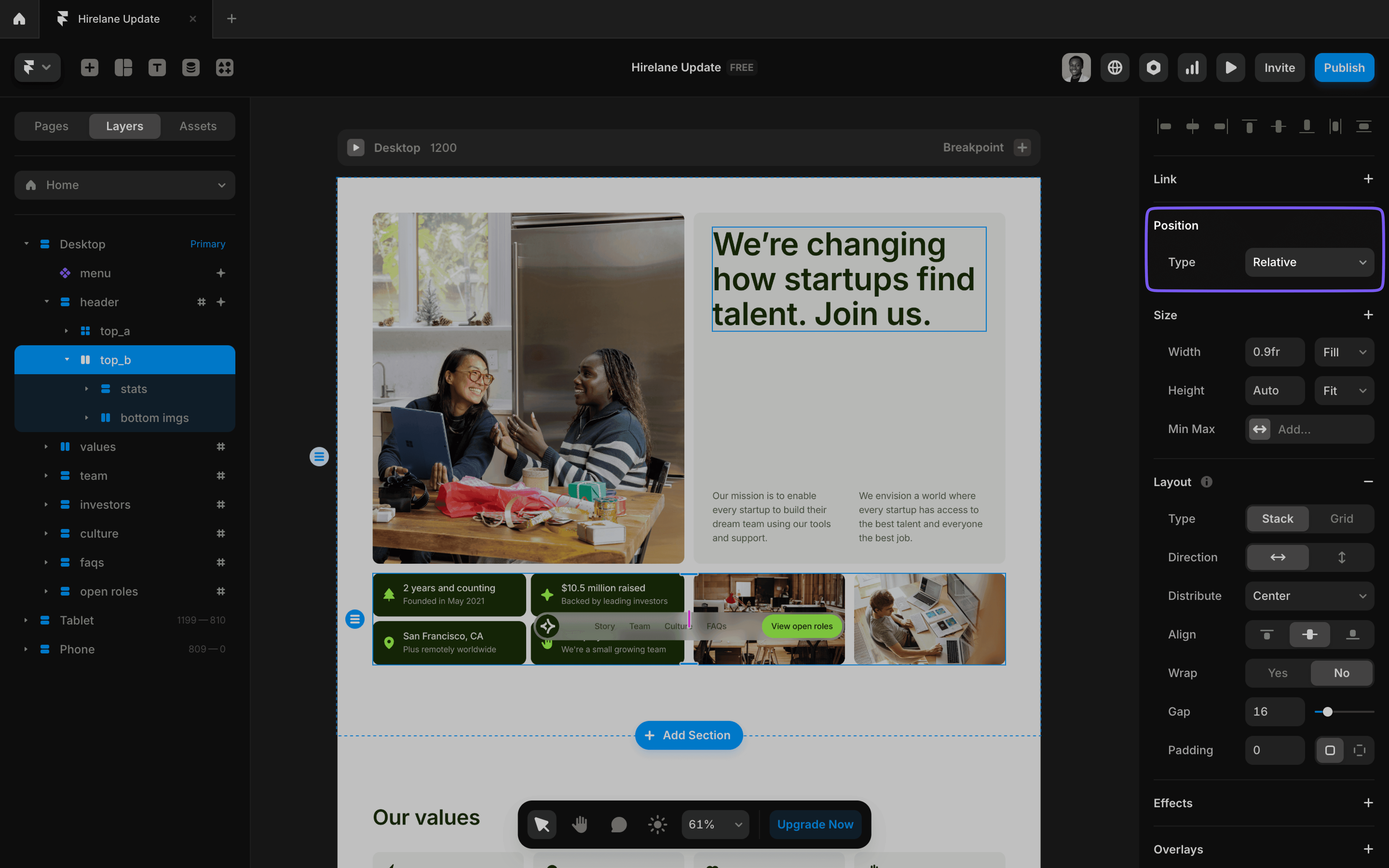
- Position: Control where elements appear on the page.
- Links and Interactions: Add navigation, hover effects, scroll animations, and more.
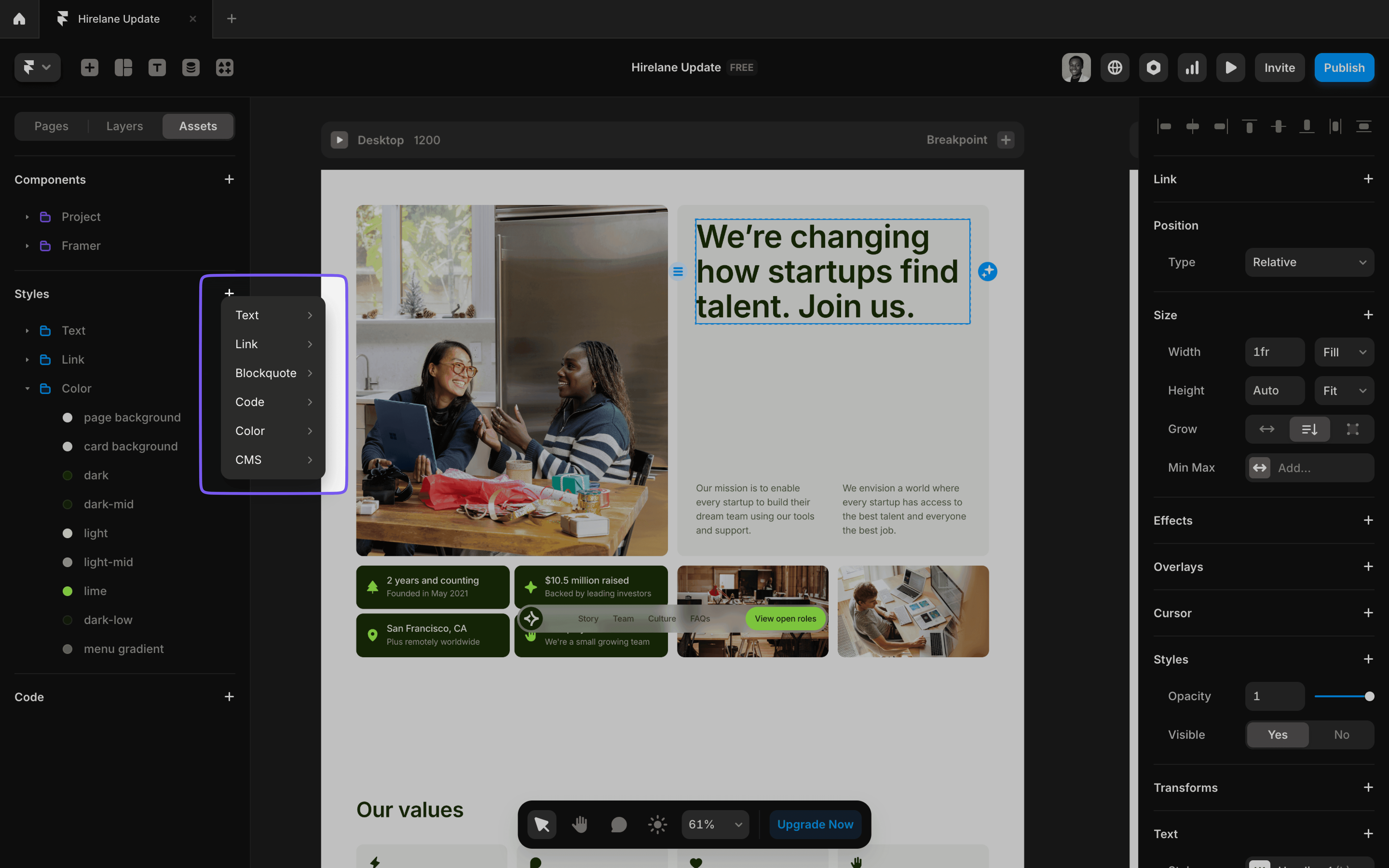
Styles
Styles in Framer work like Figma—create reusable styles to ensure consistency.
- Use styles for text, colors, links, code blocks, block quotes and CMS.
- Access saved styles in the Assets Panel. Apply them easily to elements on your canvas.
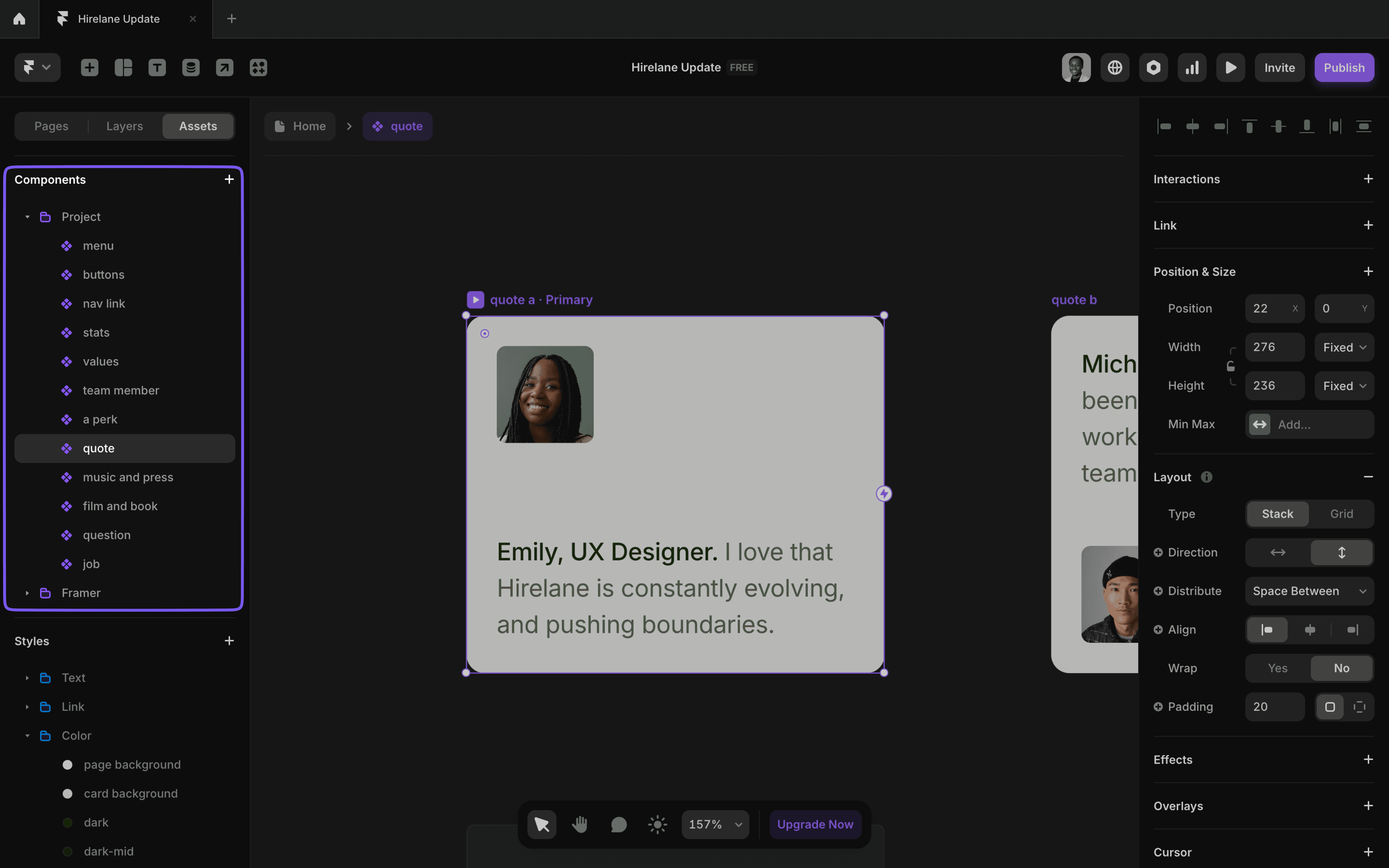
Components
Components in Framer are just like Figma’s—reusable elements that keep your design consistent eg. navbars, footers, buttons, etc.
To create a component, right-click on any element to open the context menu and select the "Create Component" option.
When you update a component, the changes apply everywhere it’s used.
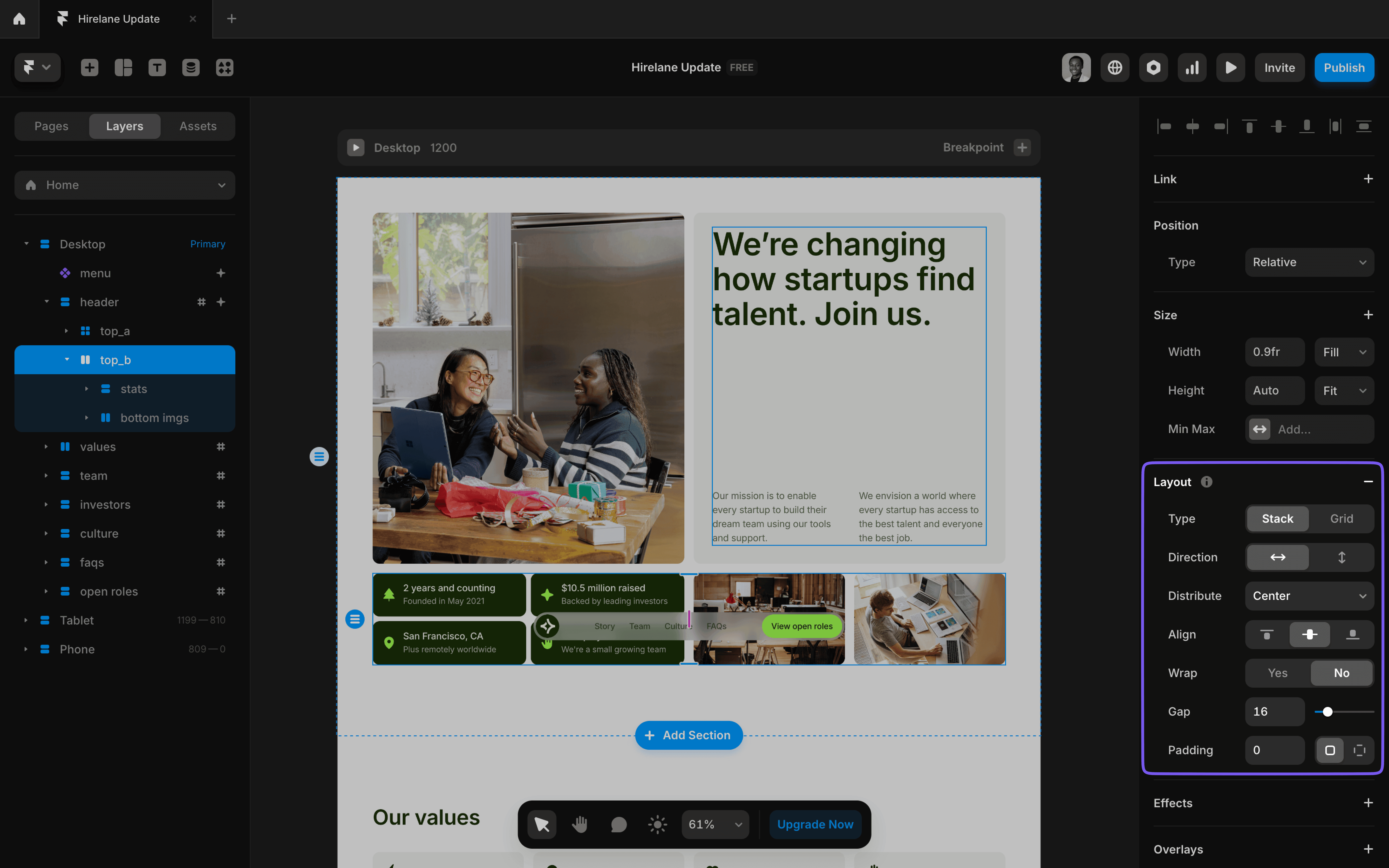
Layout and Sizing
If you’ve used Figma’s auto-layout, you’ll feel right at home with Framer’s layout tools.
Three Layout Tools:
- Frames: Group elements freely (similar to Figma’s groups).
- Stacks: Arrange elements in a structured vertical or horizontal layout. Adjust alignment, spacing, and direction easily.
- Grids: Organize elements in rows and columns for structured layouts.
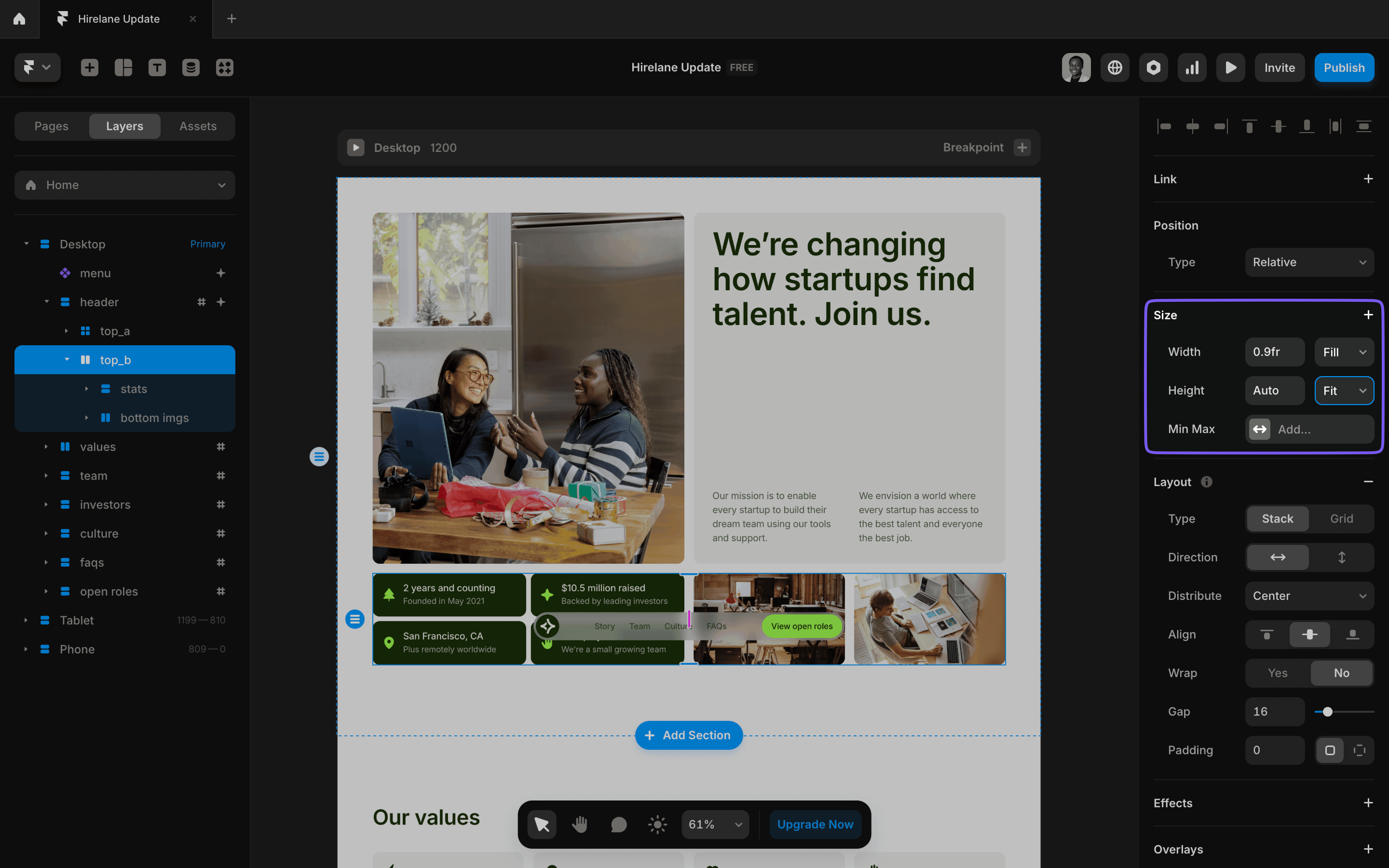
Sizing Options:
- Fixed: Set a specific size in pixels.
- Relative: Use percentages (e.g., 50%).
- Fill: Elements grow to fill available space.
- Fit Content: Size adjusts based on the content.
- Viewport: This is exclusively for height and sets it relative to the height of the browser’s viewport. For example, setting it to 100vh makes the element’s height equal to the full height of the screen, regardless of content.
Positioning
Positioning in Framer is similar to Figma but offers more flexibility tailored for web design.
It determines how elements appear and behave on the page, and it works just like CSS positioning.
- Relative: The default setting—elements flow naturally within their parent container.
- Absolute: Place elements anywhere on the canvas, ignoring other content. Great for precise positioning.
- Fixed: Lock elements to the viewport so they stay visible as users scroll (e.g., sticky headers).
- Sticky: Similar to fixed, but the element “sticks” within a parent container until you scroll past it.
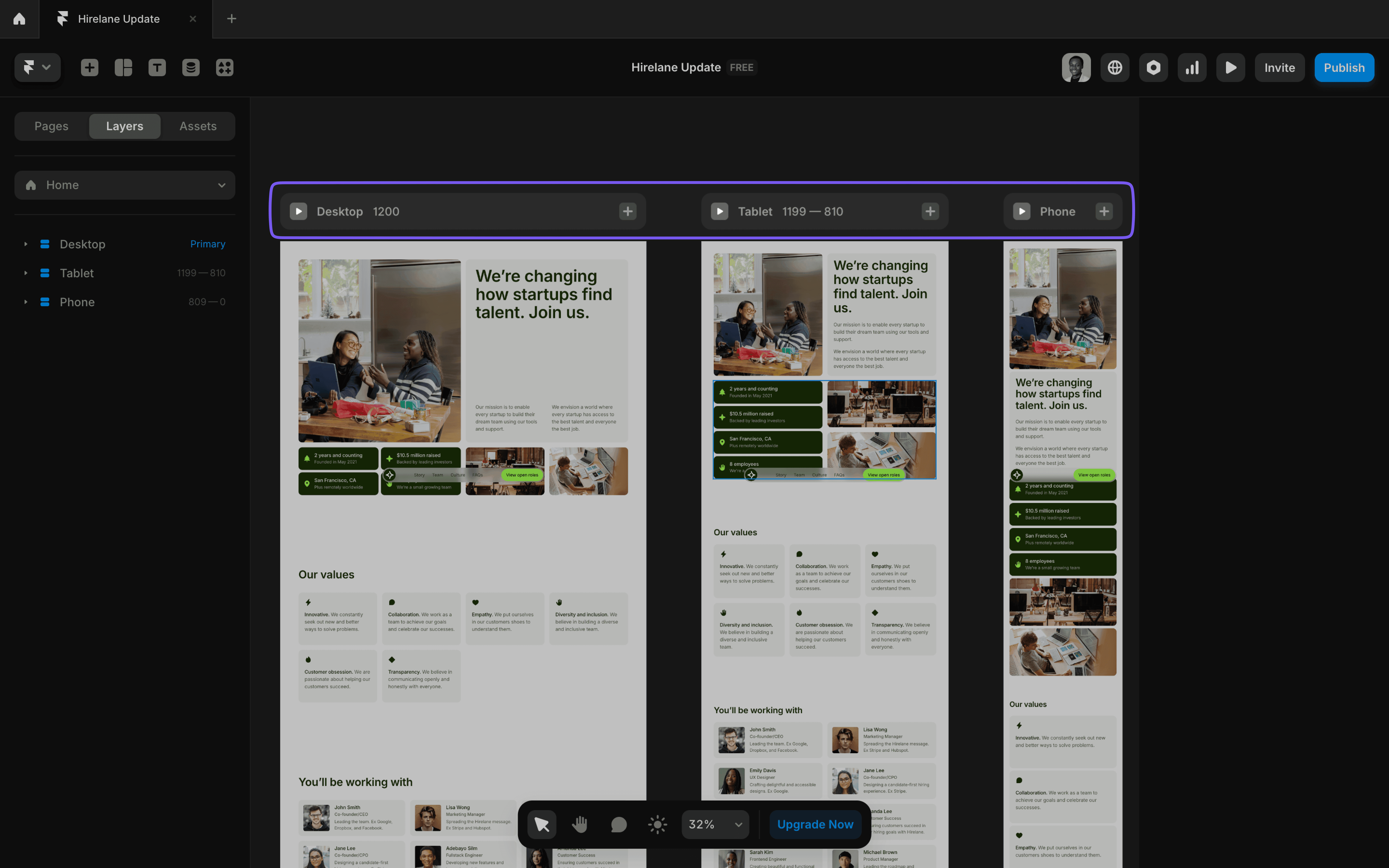
Breakpoints for Responsive Design
Unlike Figma, Framer is built for the web, which means you need to consider how your design looks on different devices.
What to do:
- Add breakpoints for common screen sizes (e.g., Desktop: 1200px, Tablet: 810px, Phone: 390px).
- Adjust layouts for each breakpoint. Framer will copy your existing design—just tweak it for smaller screens.
- Use Stacks and Grids to easily rearrange content for responsiveness.
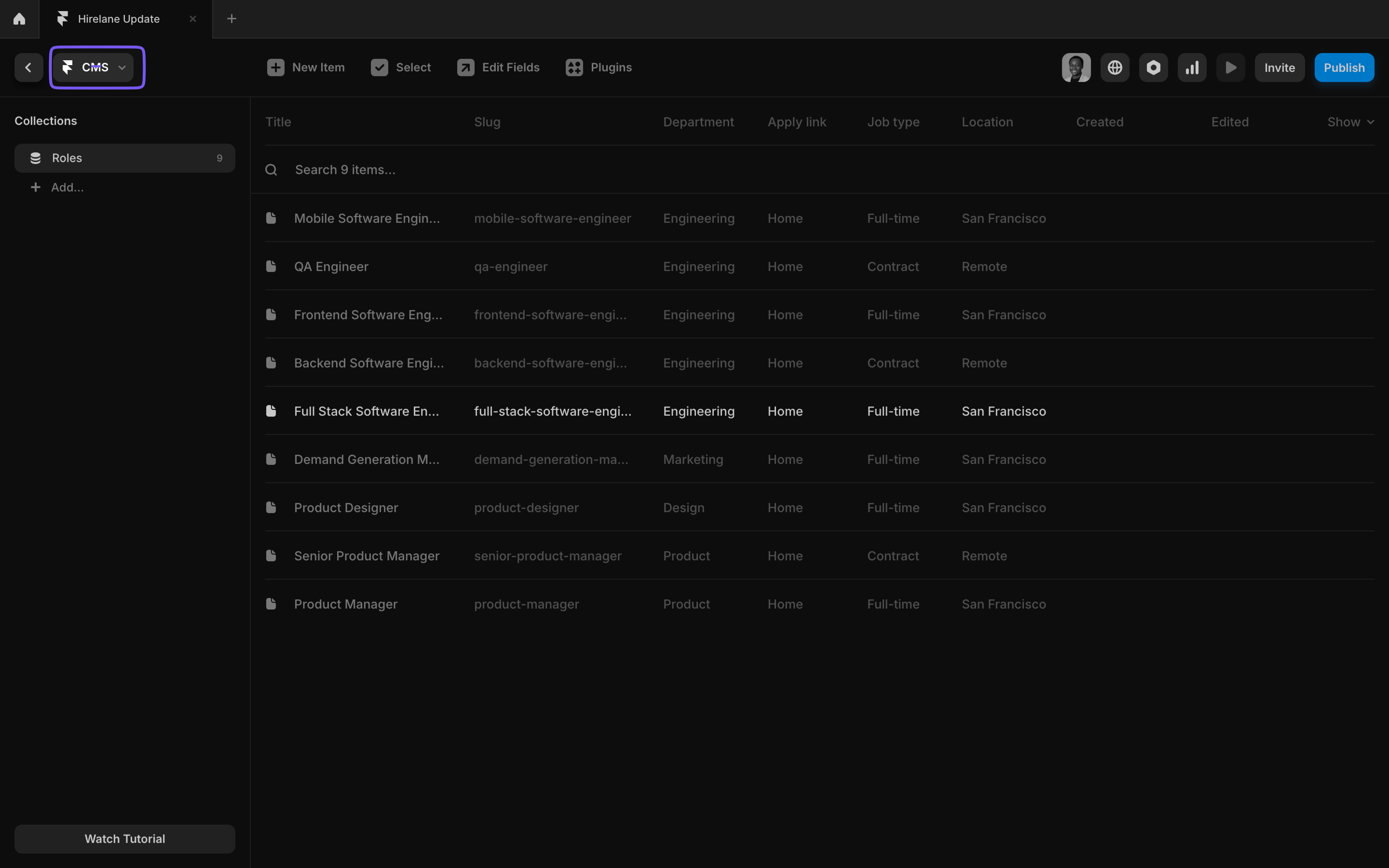
The Framer CMS
Framer’s CMS is a game-changer for dynamic websites.
It allows you to pull content into your design, such as blog posts, portfolios, or team pages.
- CMS Collections: Create a collection for things like “Blog Posts.”
- Index Page: A page that lists all items in a collection.
- Details Page: Automatically generates individual pages for each item.
You can learn more about how the CMS works here.
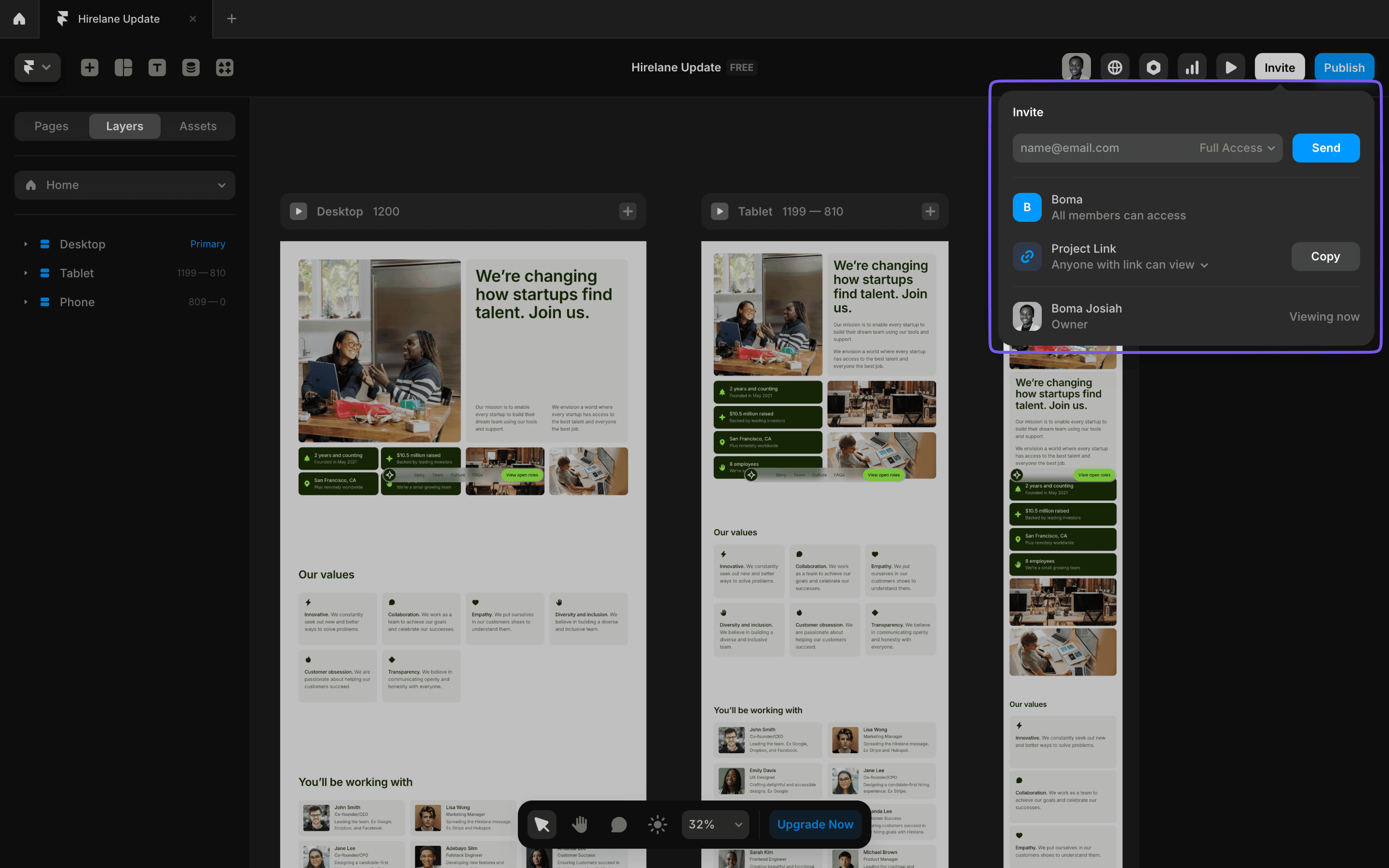
Collaboration
Framer makes teamwork easy, just like Figma.
You can invite teammates to view or edit your project, enabling smooth collaboration on your designs.
Here’s how it works:
- Invite Teammates: Use the invite button at the top-right corner or share an invite link to give others access.
- Leave Comments: Collaborators can leave comments directly on your design for feedback and discussion.
- Real-Time Collaboration: Work alongside your team in real-time, with updates synced instantly.
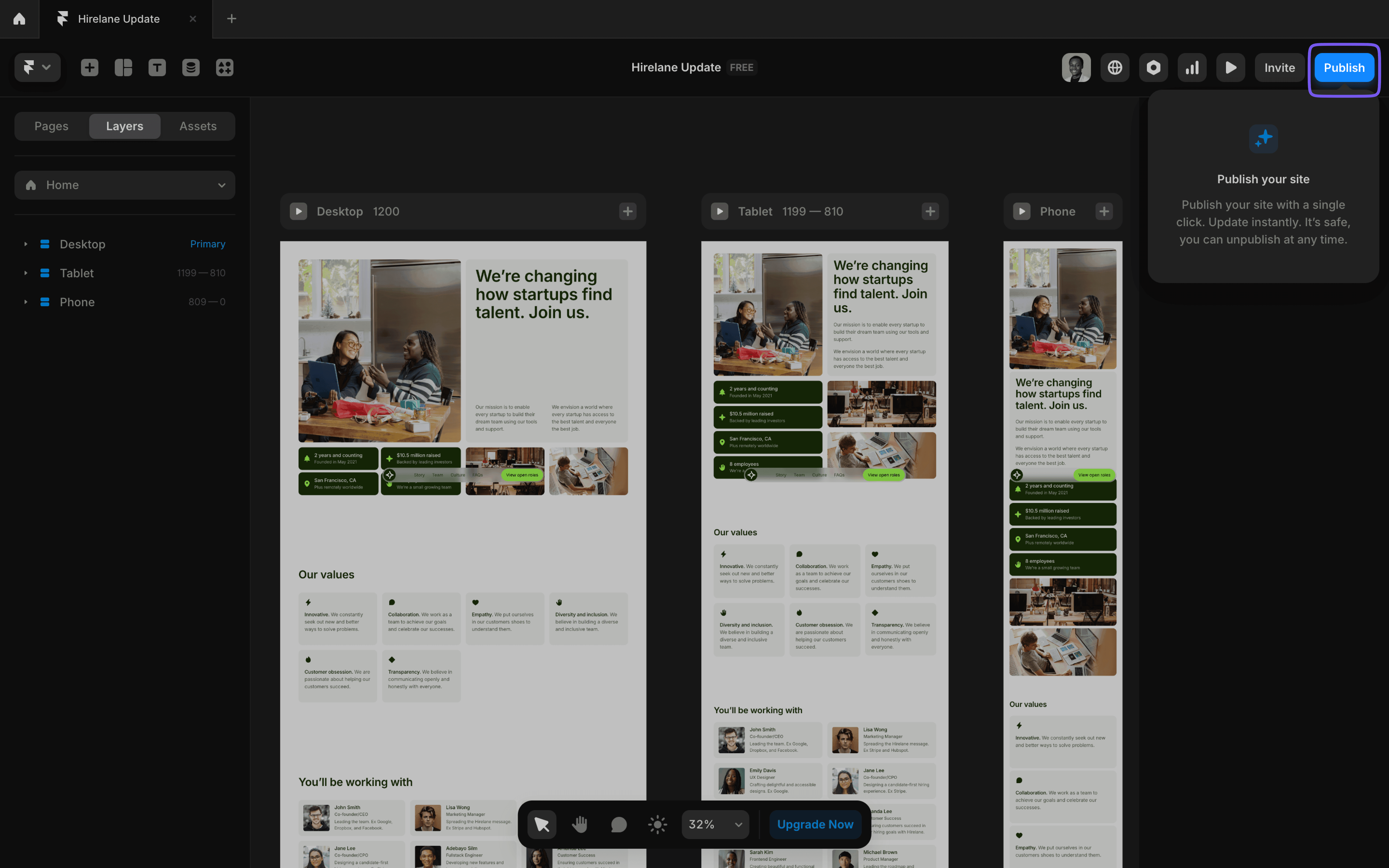
Preview and Publish
This is where Framer shines! Once your site is ready:
- Preview: Click the play icon to see how your site looks across devices.
- Publish: Click the publish button to make your site live. Framer will give you a default domain, or you can connect a custom one.
- Optimize: Add a meta title, description, favicon, and social preview image in the site settings.
Framer is a powerful tool for Figma users ready to build live, responsive websites.
While the interface will feel familiar, features like breakpoints, positioning, and the CMS open up a whole new world of possibilities.
Start small—import a Figma design, experiment with layouts, and hit publish. Before you know it, you’ll be creating fully functional sites without writing a single line of code.
Launch faster with premium Framer templates
Pick from our collection of sleek, professional Framer templates designed to get your startup online fast.
View all templates
Keep reading
Our blog answers the most common Framer questions with clear, step-by-step tutorials to help you succeed.
View more tutorials

Join the weekly newsletter and get 25% off
Subscribe for free to the newsletter, get weekly Framer tutorials and insights—straight to your inbox.
Join 1,200+ subscribers. One email per week, unsubscribe anytime.