If you're just starting with Framer, one of the most powerful features you'll encounter is its component-based architecture.
Framer components allow you to create reusable, customizable elements that streamline your design process.
By mastering components, you can create interactive, responsive web designs efficiently while maintaining consistency across your projects.
This guide shows you what Framer components are, how they work, and best practices for using them effectively.
What are Framer components?
At their core, Framer components are reusable design elements.
These elements can range from simple UI elements, like buttons or forms, to more complex interactive features.
Using components ensures consistency throughout your project and saves time by allowing you to reuse and customize elements instead of recreating them repeatedly.
For example, imagine designing a website. Instead of designing each button separately, you can create a button component with customizable styles and variants. Any updates to the component automatically apply across all instances, ensuring a unified design.
Components empower designers to:
- Maintain consistency across projects.
- Save time by reusing and customizing elements.
- Create interactive, responsive web designs efficiently.
How to create components in Framer
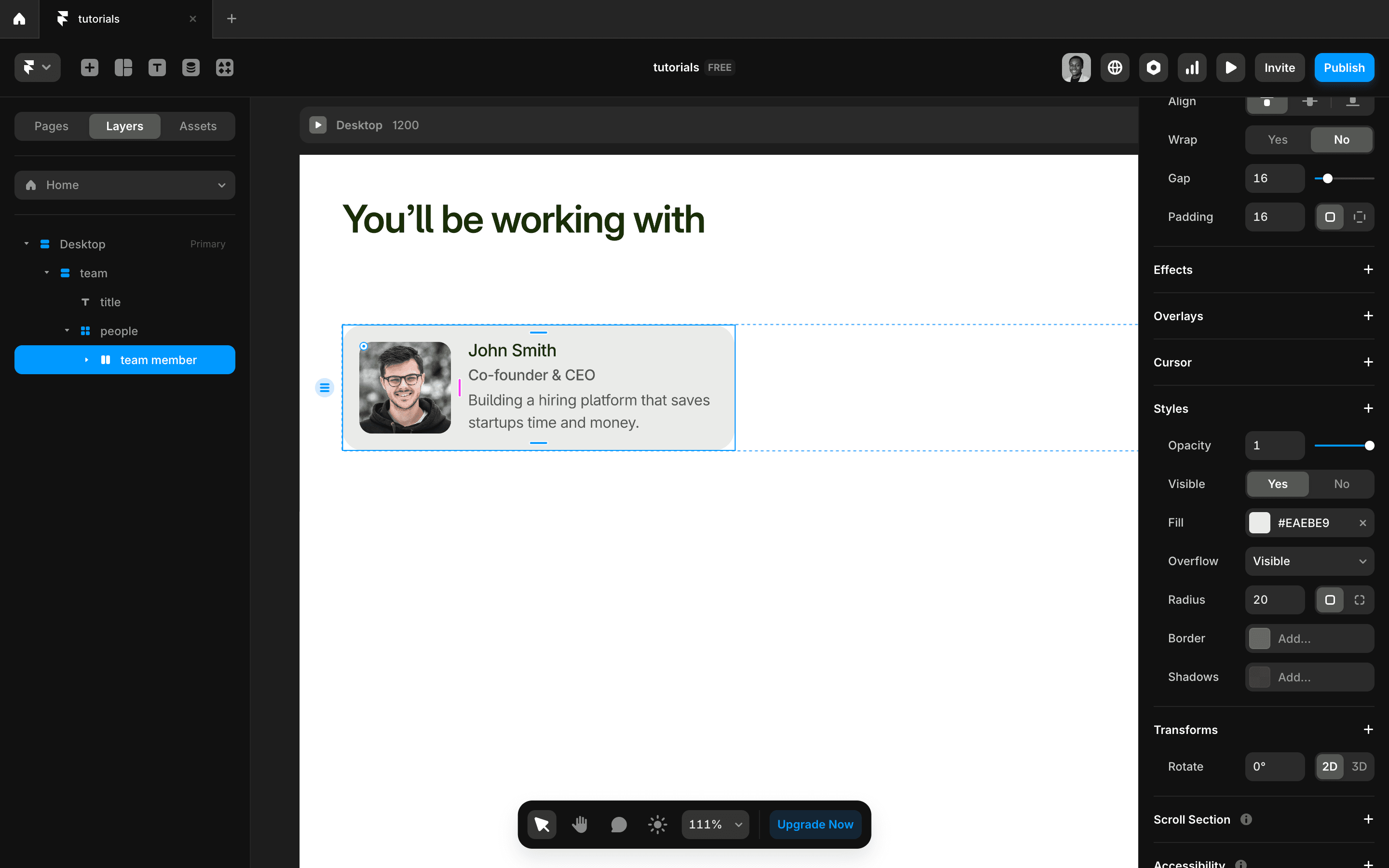
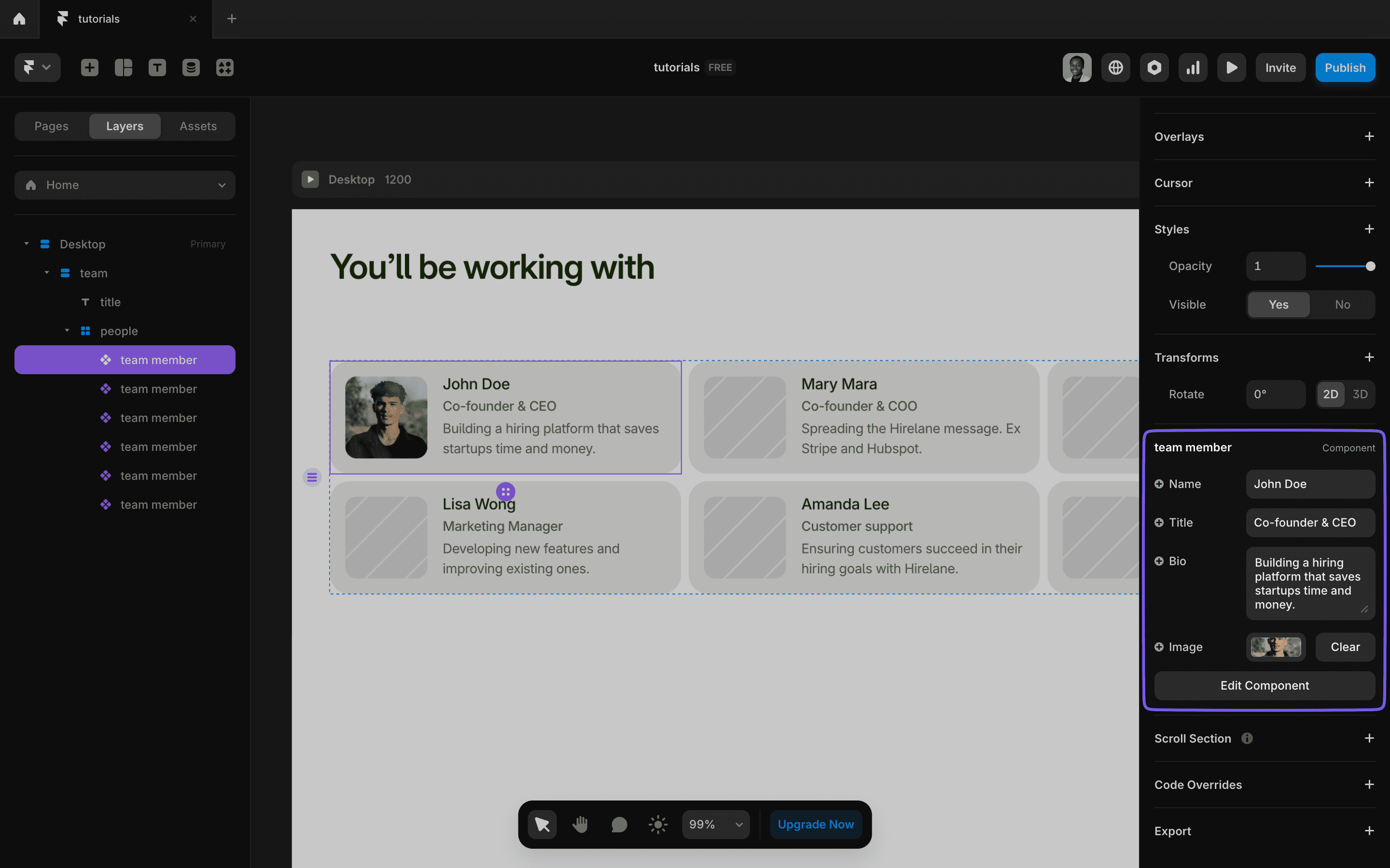
Let's work on a component together—we'll be making a team member card.
First, design the component.
You can do this on any page in your Framer site. Decide what elements on your site you want to make into a component.
As a general rule, if an element will be appearing several times on your site, it’s a good idea to make it a component so it’s reusable and easy to edit (make changes in one place, and it applies everywhere).
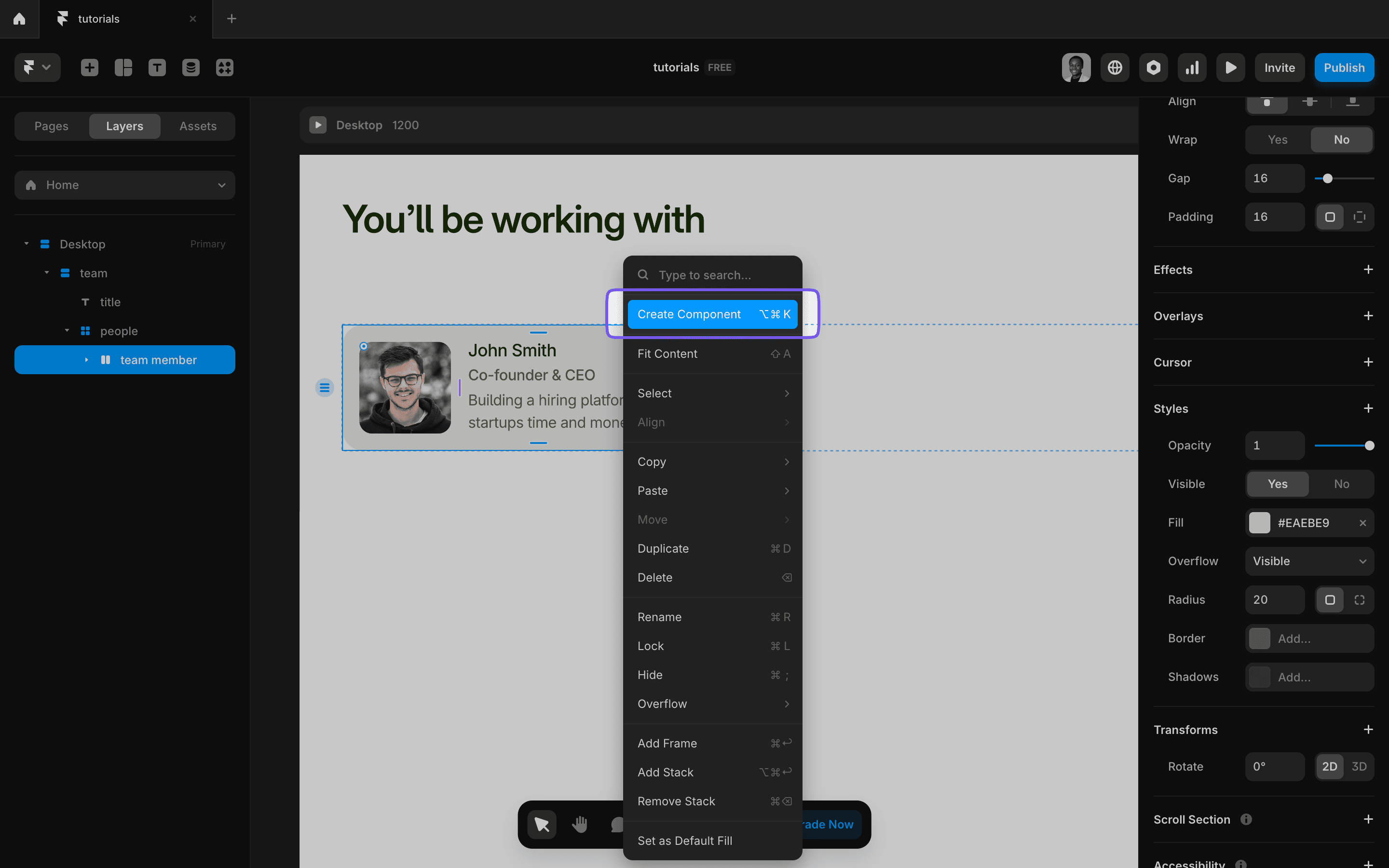
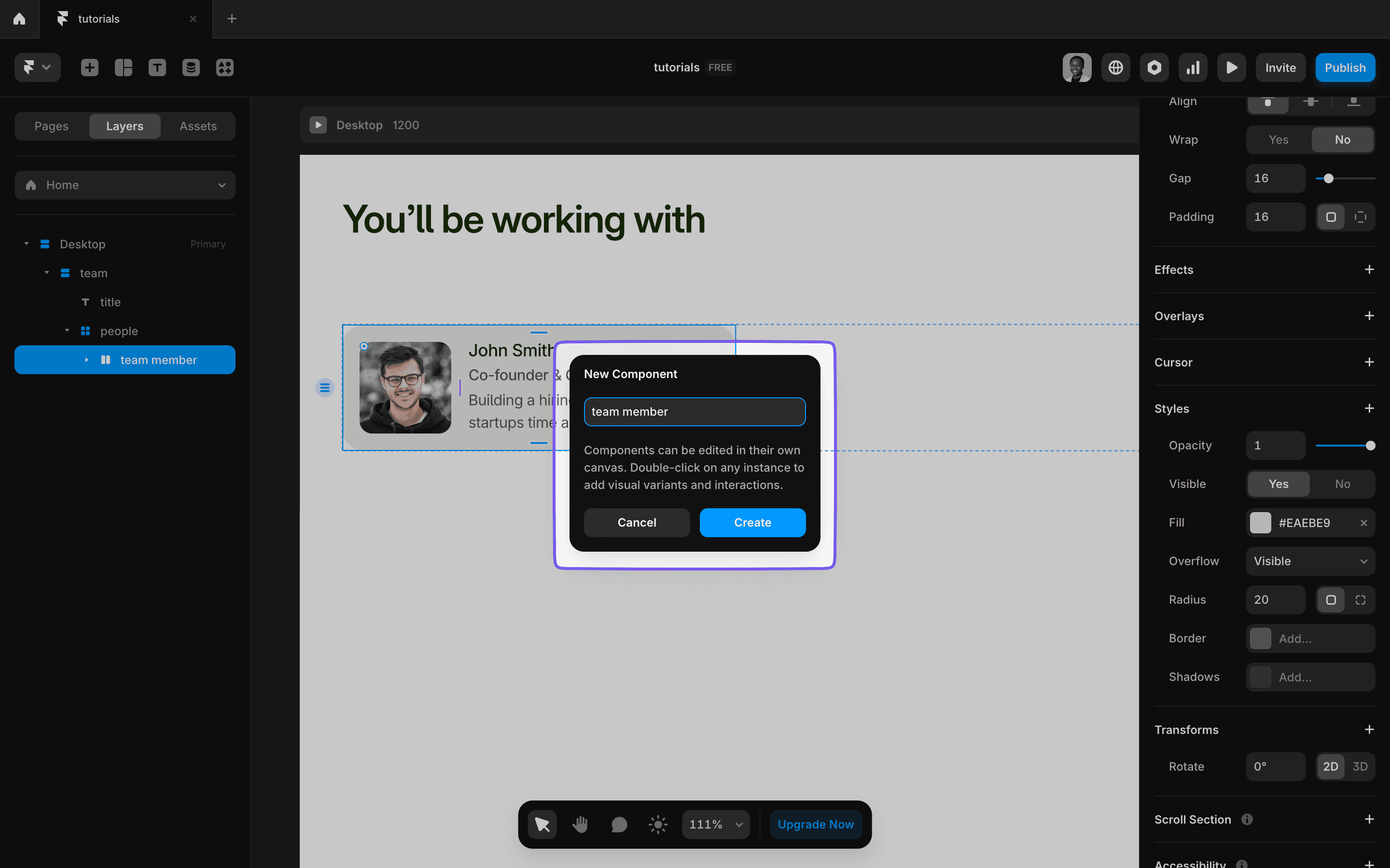
Once the element is ready, you can right-click and select Create Component or use Command + Option + K on Mac. You’ll be asked to name your component. Give it a clear, descriptive name so it’s easy to find, and click Create.
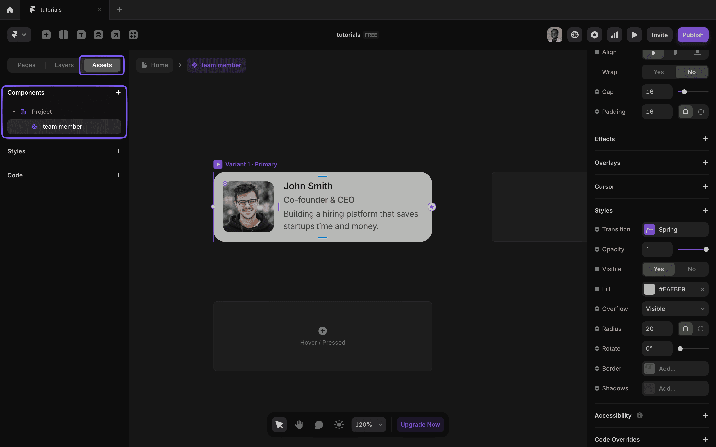
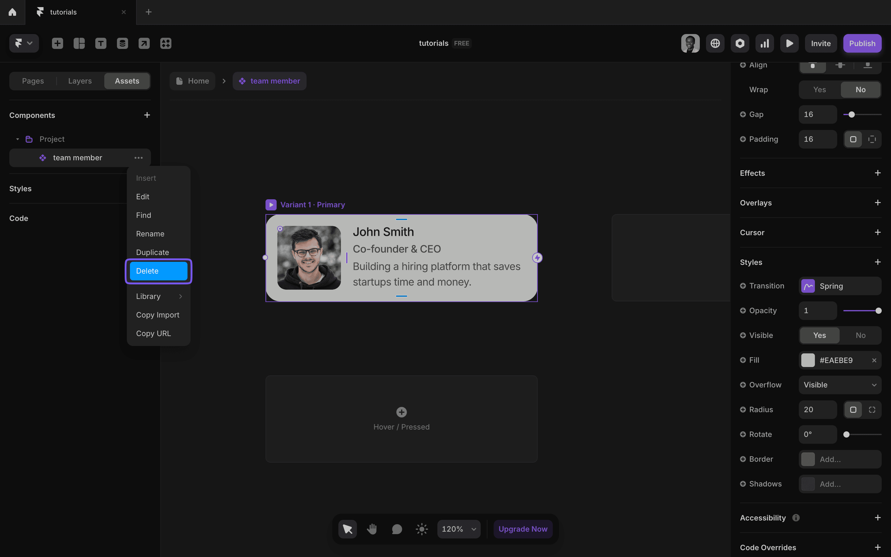
There’s a dedicated page for editing each component. Double-click on a component to open this menu or access it from the Assets Panel under the Components section.
Note that even if you delete an instance of a component from the canvas, it does not delete the actual component itself. To delete a component, you can do it from the Components Menu.
Utilizing Variables and Variants
Variables
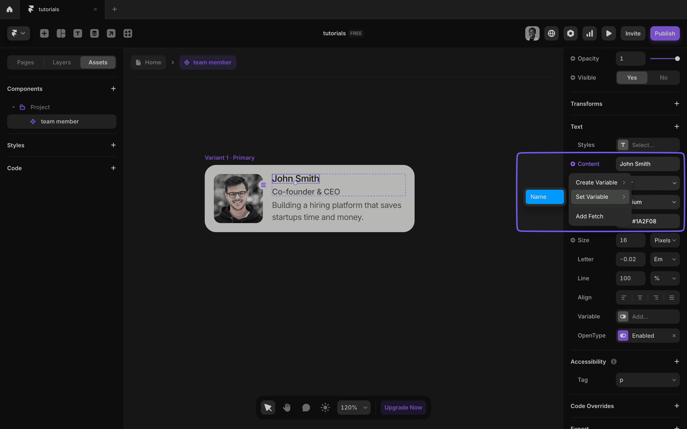
Instead of hardcoding values in your component, variables allow you to expose these values so they can be edited where each instance of the component is used.
In our example of a team member card, instead of having a fixed image, name, role, and social link, we can make each one a variable so that wherever the card is used, we can swap it out for actual content.
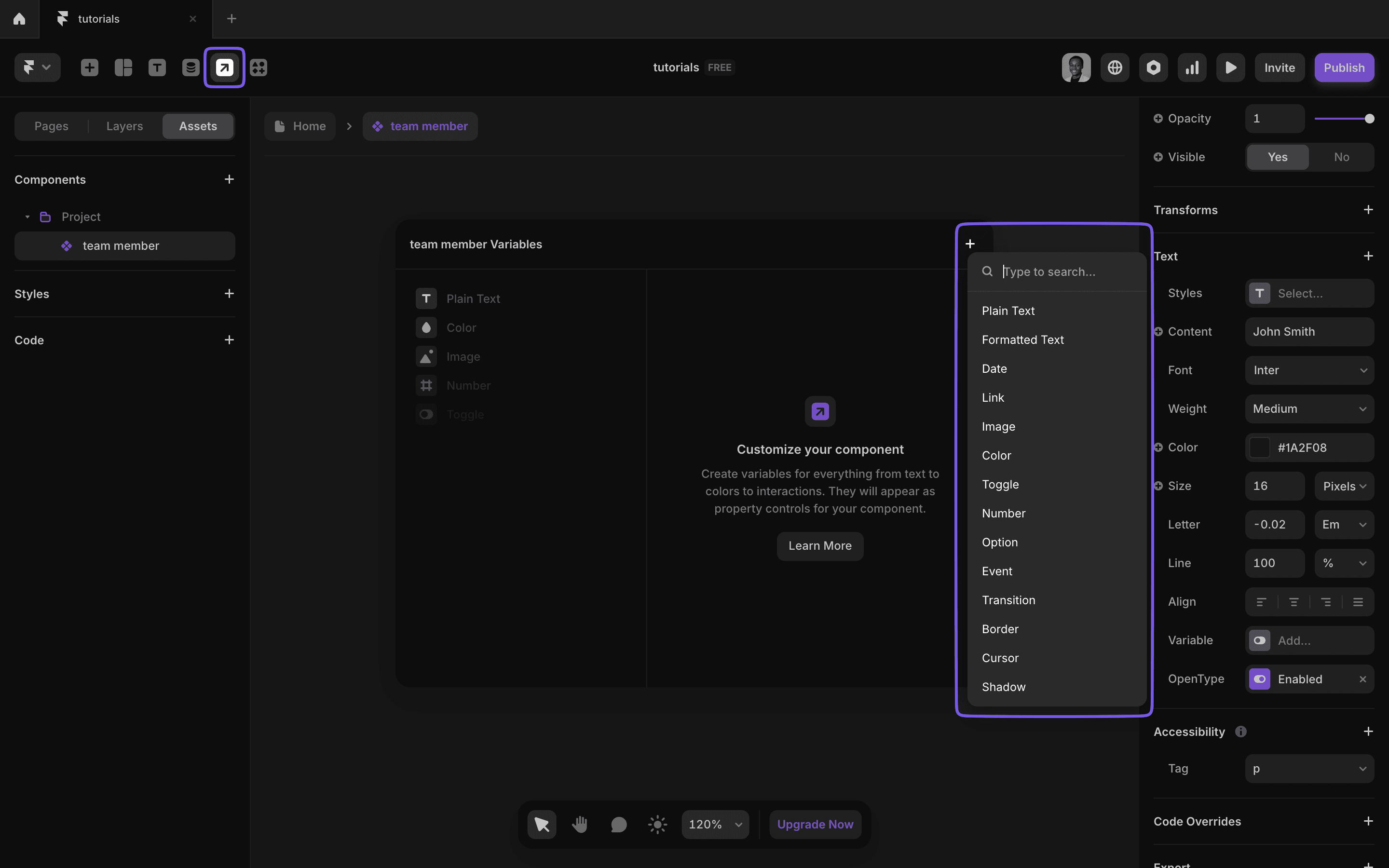
You can access the variables from the top-right menu. After creating a variable, you can then select the element and set the variable. Click the plus sign next to Content for text and Fill for color and images. You can do the same for links.
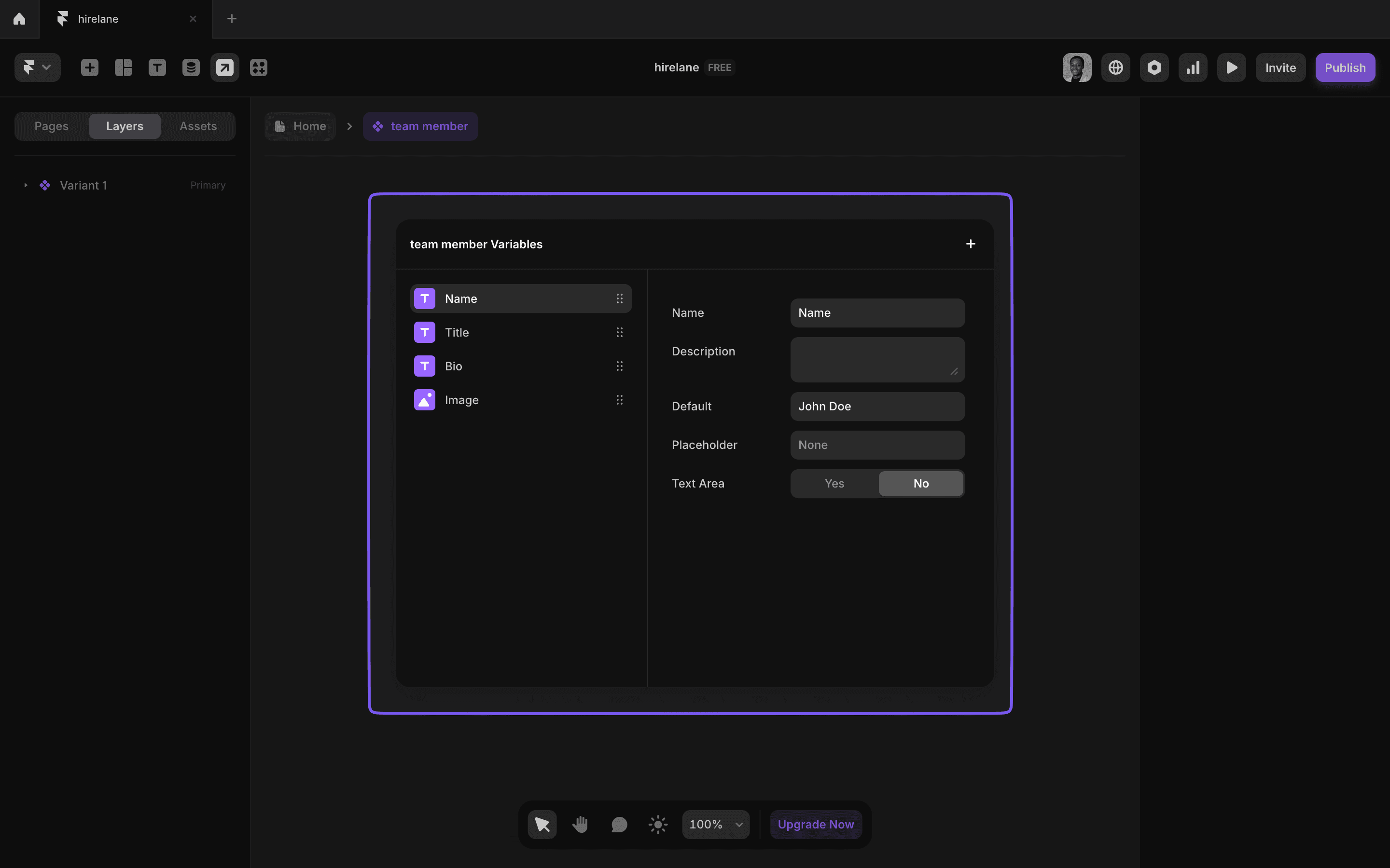
Now, when you use the team member cards, all these variables will appear in the Properties Panel so you can fill out the actual data.
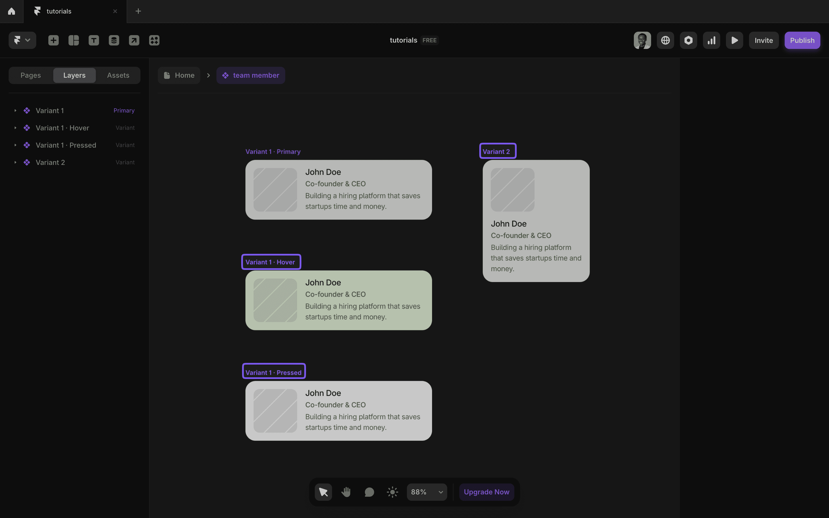
Variants
Variants allow you to create versions or variations of the same component.
For example, you can create variants for smaller screen sizes, different button sizes, or slightly different designs.
Variants also allow you to add hover and pressed states, making your components more interactive.
Tips for Using Framer Components
Here are some essential tips to keep in mind when working with components in Framer:
- Maintain Consistency: Use a clear naming convention and structure to keep your components organized.
- Design for Reusability: Think about how components can be reused across multiple projects. Keep them flexible yet functional.
- Leverage Variables and Variants: Maximize interactivity and customization by using these features effectively.
- Organize Components: You can organize components into folders to keep things neat, especially on large projects.
- Use Existing Components: Framer has a variety of built-in components, and you can also access external libraries to speed up your workflow.
Start experimenting with Framer components today, and transform how you design.
By mastering the use of components, variables, and variants, you can create dynamic, interactive designs that are easy to maintain and scale.
Launch faster with premium Framer templates
Pick from our collection of sleek, professional Framer templates designed to get your startup online fast.
View all templates

Keep reading
Our blog answers the most common Framer questions with clear, step-by-step tutorials to help you succeed.
View more tutorials

Join the weekly newsletter and get 25% off
Subscribe for free to the newsletter, get weekly Framer tutorials and insights—straight to your inbox.
Join 1,200+ subscribers. One email per week, unsubscribe anytime.