How to Use Breakpoints in Framer for Responsive Design
Creating a website that works seamlessly across different devices is essential. Responsive design ensures your site adapts to any screen size, whether it's a large desktop monitor, a tablet, or a smartphone.
One of the most powerful tools in Framer to achieve responsive design is breakpoints.
In this guide, we’ll look at how breakpoints work in Framer, how to use them effectively, and best practices to make your designs flexible and user-friendly.
By the end of this guide, you’ll have a clear roadmap to building stunning responsive websites in Framer with minimal effort.
What are breakpoints in Framer?
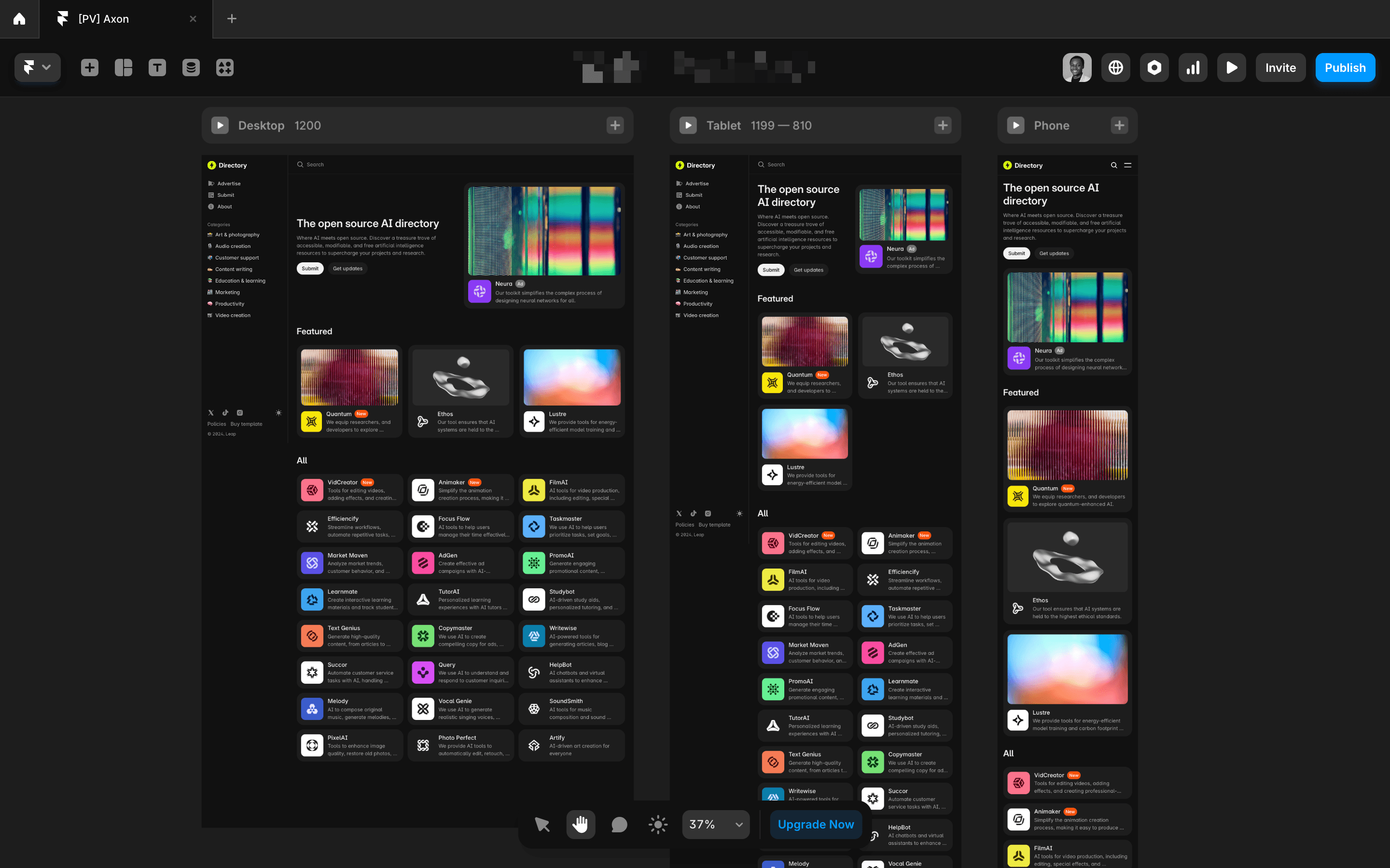
A breakpoint is a specific screen width where your website's layout changes to adapt to a different device.
For example, your desktop layout may look great on a 1440px screen, but once the screen width shrinks to 810px (a tablet), the layout might need adjustments to stay readable and functional.
Breakpoints help you make those adjustments at key screen widths.
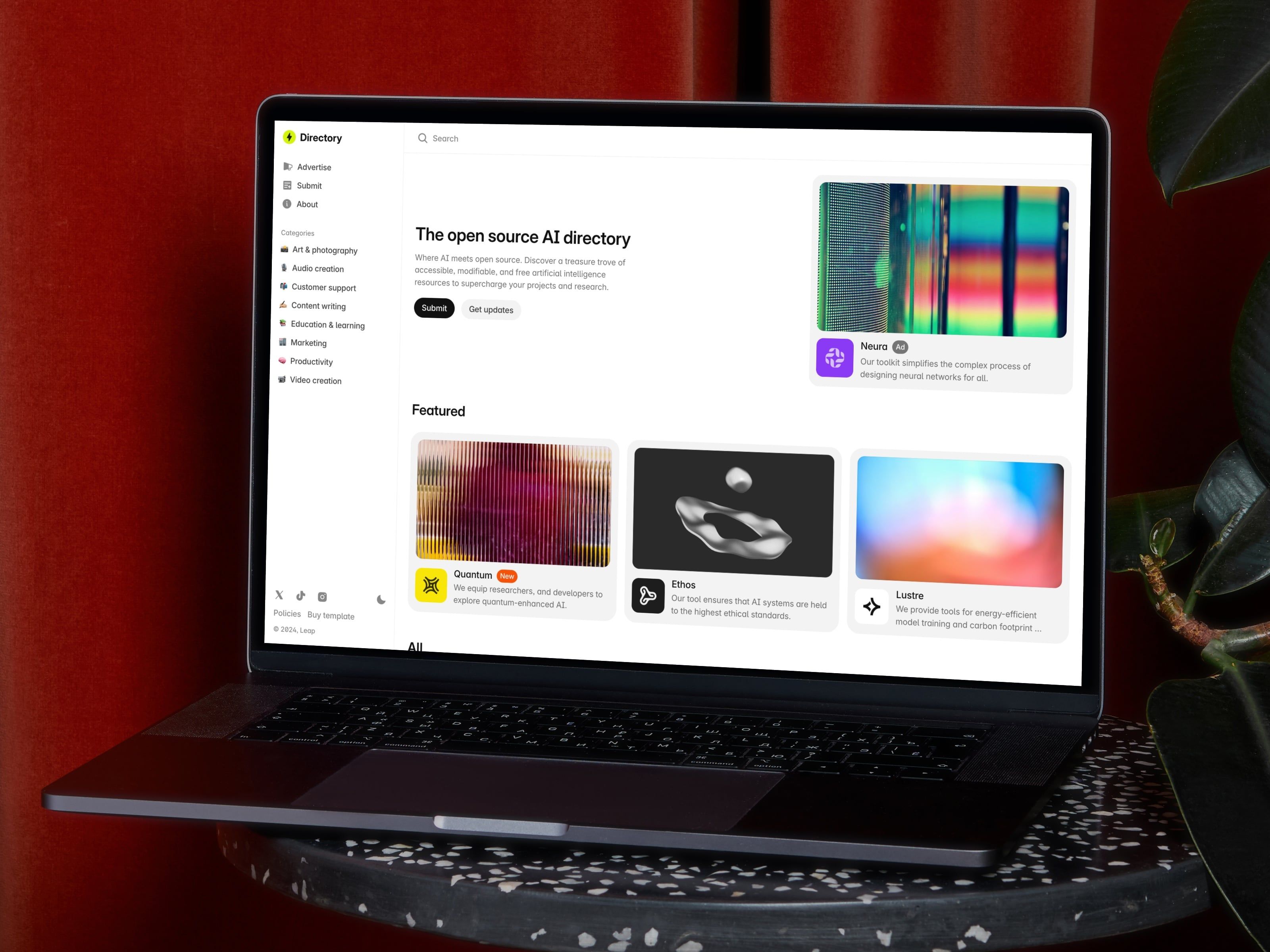
In Framer, breakpoints allow you to create different versions of your layout for desktop, tablet, and mobile views, ensuring your website always looks polished across all screen sizes.
How do breakpoints work in practice?
Here’s a practical breakdown of how breakpoints work in Framer:
- Let’s say you set a breakpoint at 810px. That layout will apply to all screen sizes between 810px and the next breakpoint, either smaller (e.g., 390px) or larger (e.g., 1200px).
- Once the screen size reaches a different breakpoint (say 390px), Framer will switch to that specific layout.
Framer’s breakpoints work cascading from largest to smallest. This means:
- Changes made at a larger breakpoint will affect all smaller breakpoints below it.
- Changes made at a smaller breakpoint will only apply to that specific breakpoint and won’t impact the larger ones.
This cascading behavior makes designing for responsiveness in Framer more efficient.
You can start with the largest screen size and tweak downwards, knowing that your changes will carry over unless you adjust them at smaller breakpoints.
How many breakpoints do you need?
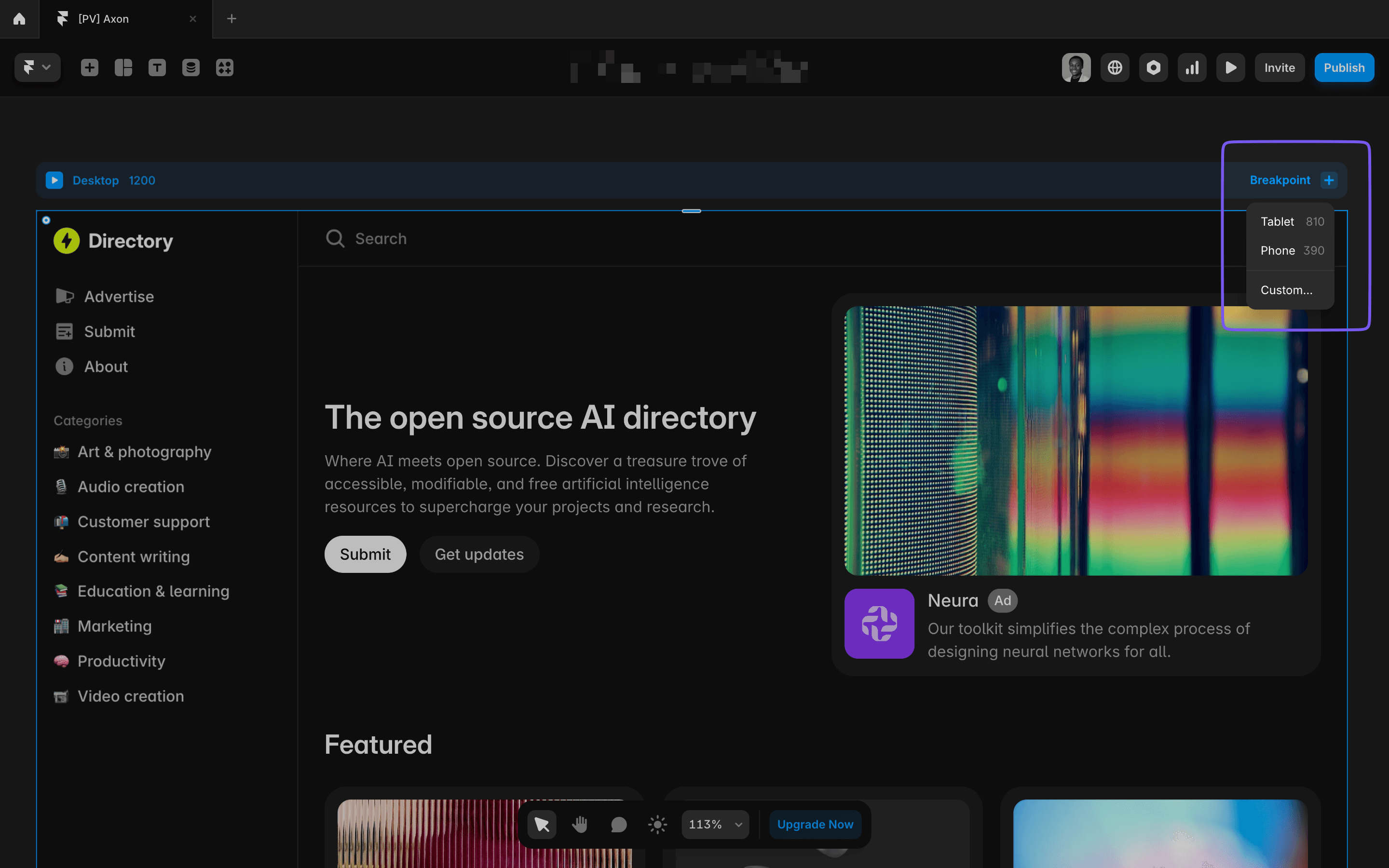
You might be wondering how many breakpoints you should use. The good news is that Framer comes with default breakpoints that cover most use cases:
- 1200px for desktop
- 810px for tablet
- 390px for mobile
These defaults are a great starting point. In most cases, you don’t need more than these three breakpoints, but you can always add custom breakpoints if your design calls for it.
How to Add Breakpoints in Framer
- Open your project in Framer.
- Click on the plus sign next to the Desktop breakpoint
- Add a new breakpoint by selecting from the existing options (Tablet, Mobile) or creating a custom one.
- Once the breakpoint is created, all elements from the previous (larger) breakpoint get copied over to the new one, so you can start making adjustments for the smaller screen.
Best Practices for Designing Responsive Layouts in Framer
Use Flexible Layout Options
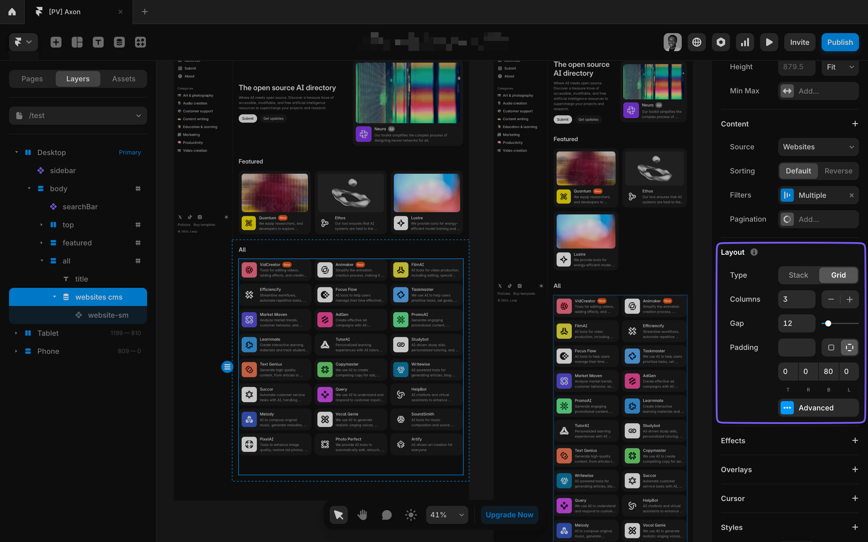
Framer’s Stacks and Grids make it easy to build layouts that adjust automatically for different screen sizes.
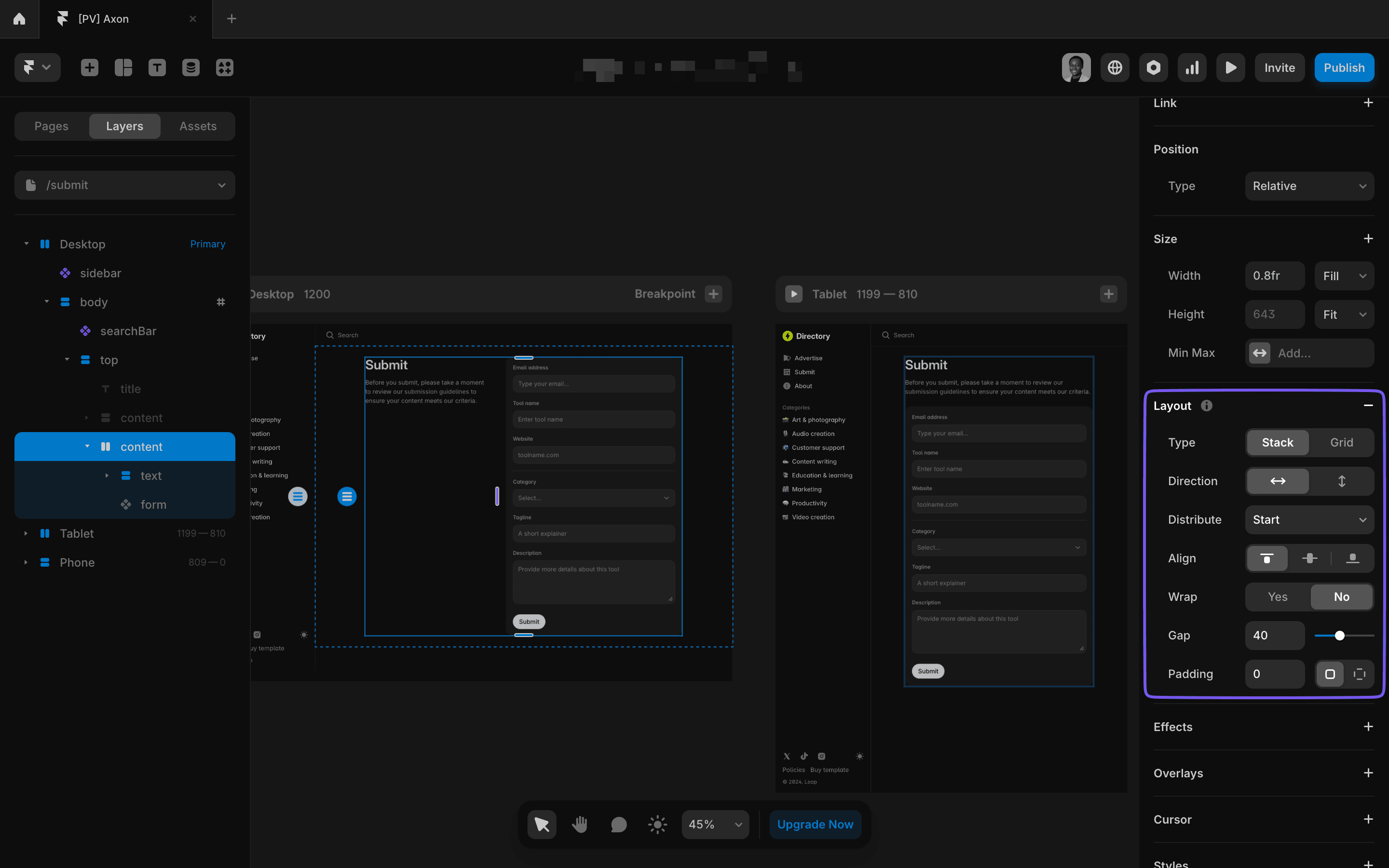
- Stacks: Let you arrange elements in rows or columns. You can change the direction of the stack at different breakpoints to fit smaller screens better.
- Grids: Offer a more structured layout. You can adjust the number of rows and columns at each breakpoint to fit the available space.
Using these tools ensures your layout remains flexible and adaptable, reducing the need for manual adjustments.
Avoid Fixed Dimensions
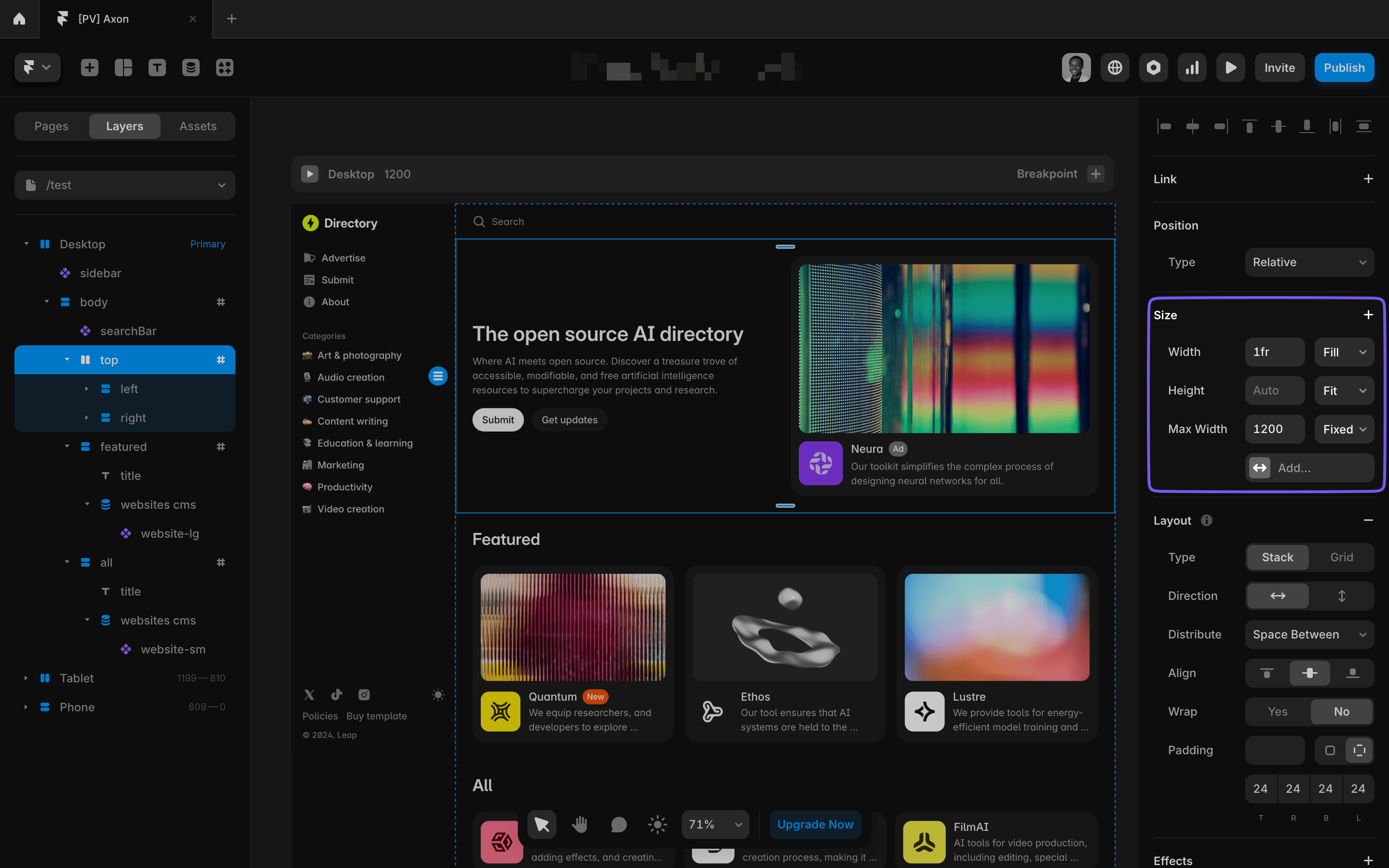
Fixed widths and heights make your design rigid and difficult to adjust across different devices. Instead:
- Use relative (percentages) or fill (fractional units) sizing options
- Apply min-width and max-width constraints to prevent elements from stretching too wide on larger screens.
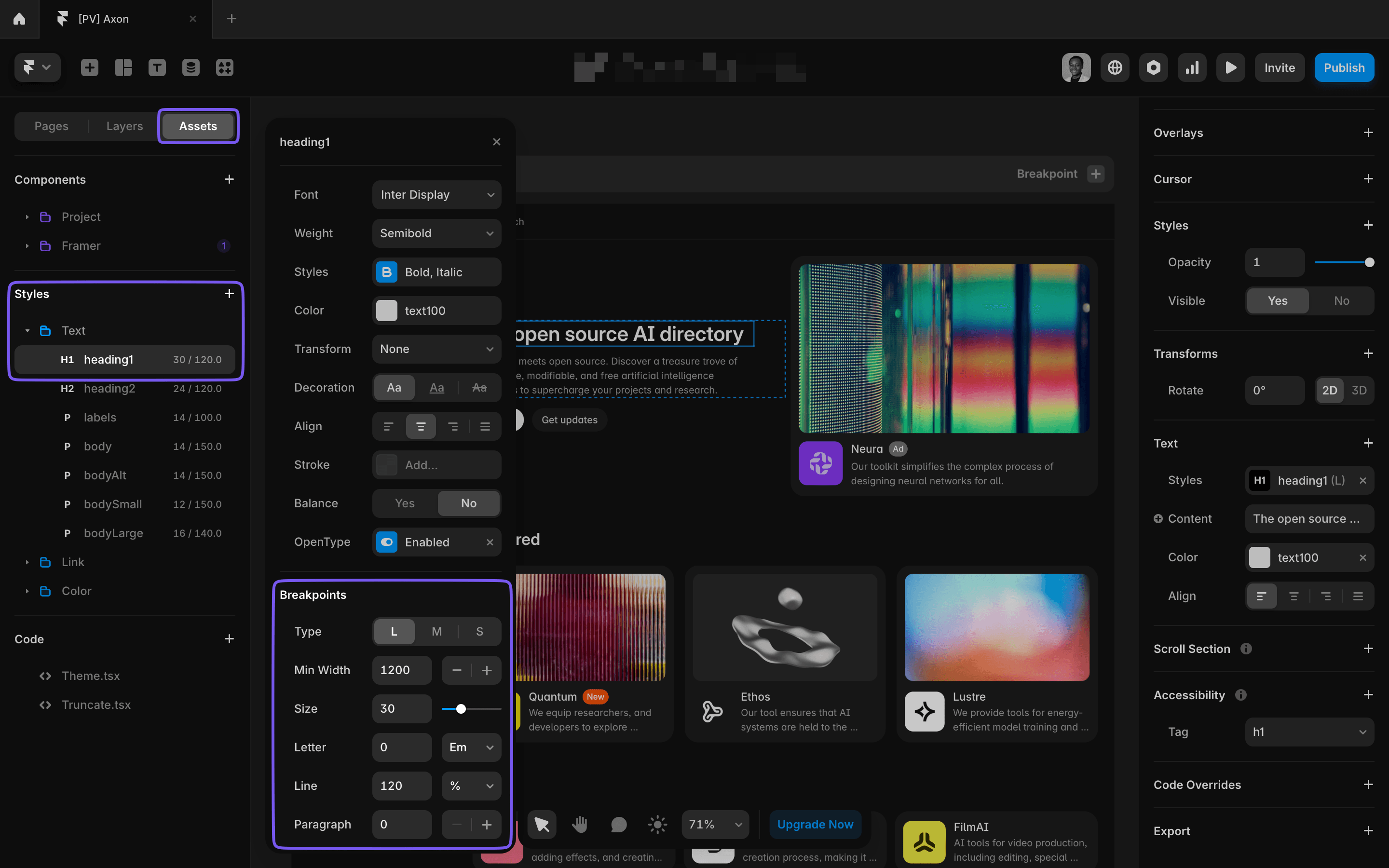
Adjust Typography for Responsiveness
Framer offers responsive typography to ensure your text looks great on all screens.
When creating a text style, you can set different sizes for large, medium, and small screens.
This way, your headings, body text, and buttons will automatically adjust, saving you from manually tweaking font sizes at each breakpoint.
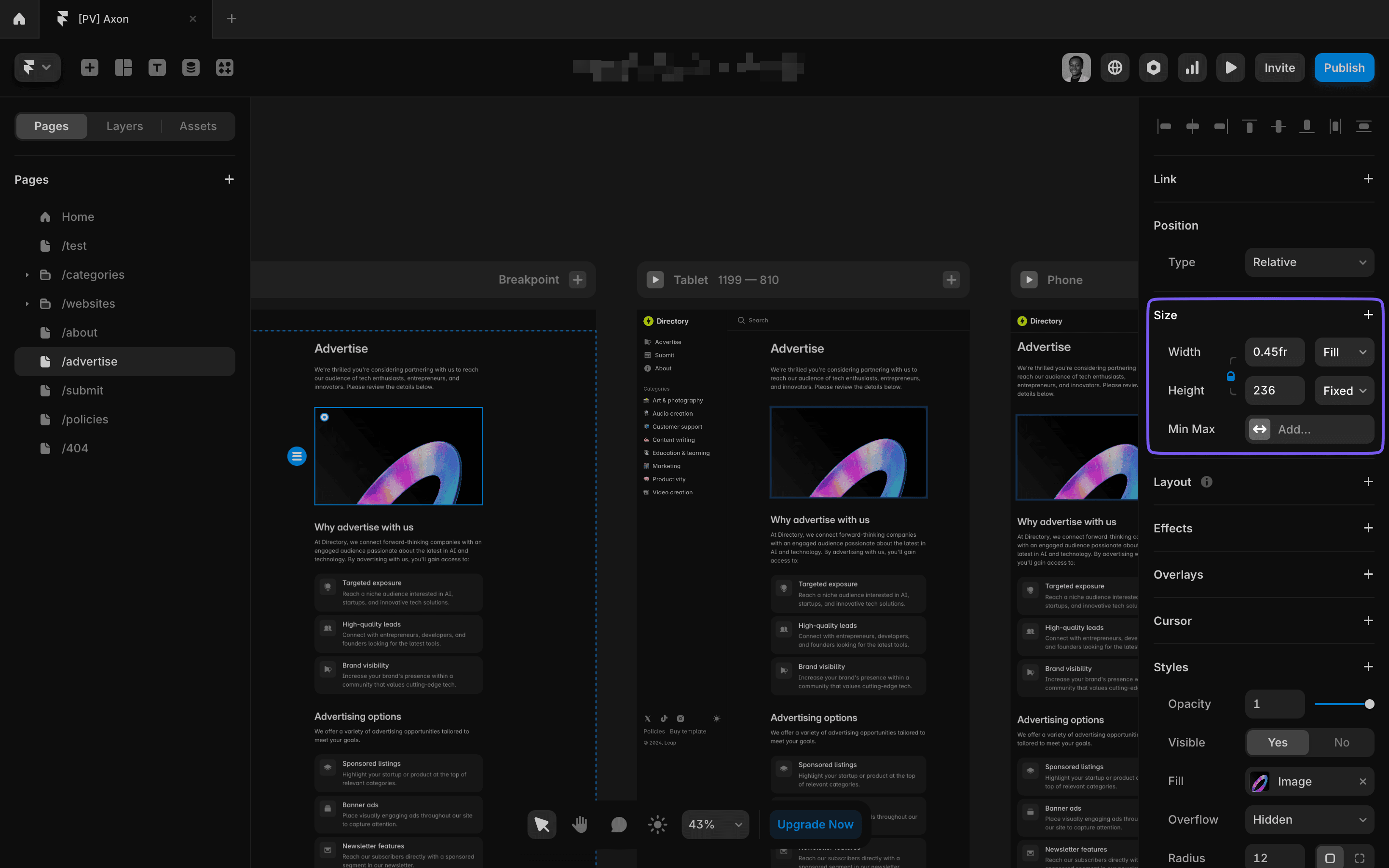
Optimize Images and Media
Images and media need to be optimized for different devices:
Enable responsiveness for your images so they can scale down for smaller screens.
SVGs are ideal for logos and icons because they remain sharp at any resolution.
For larger screens, use max-width constraints to ensure your content doesn’t stretch across the entire width of the screen, keeping your layout clean and professional.
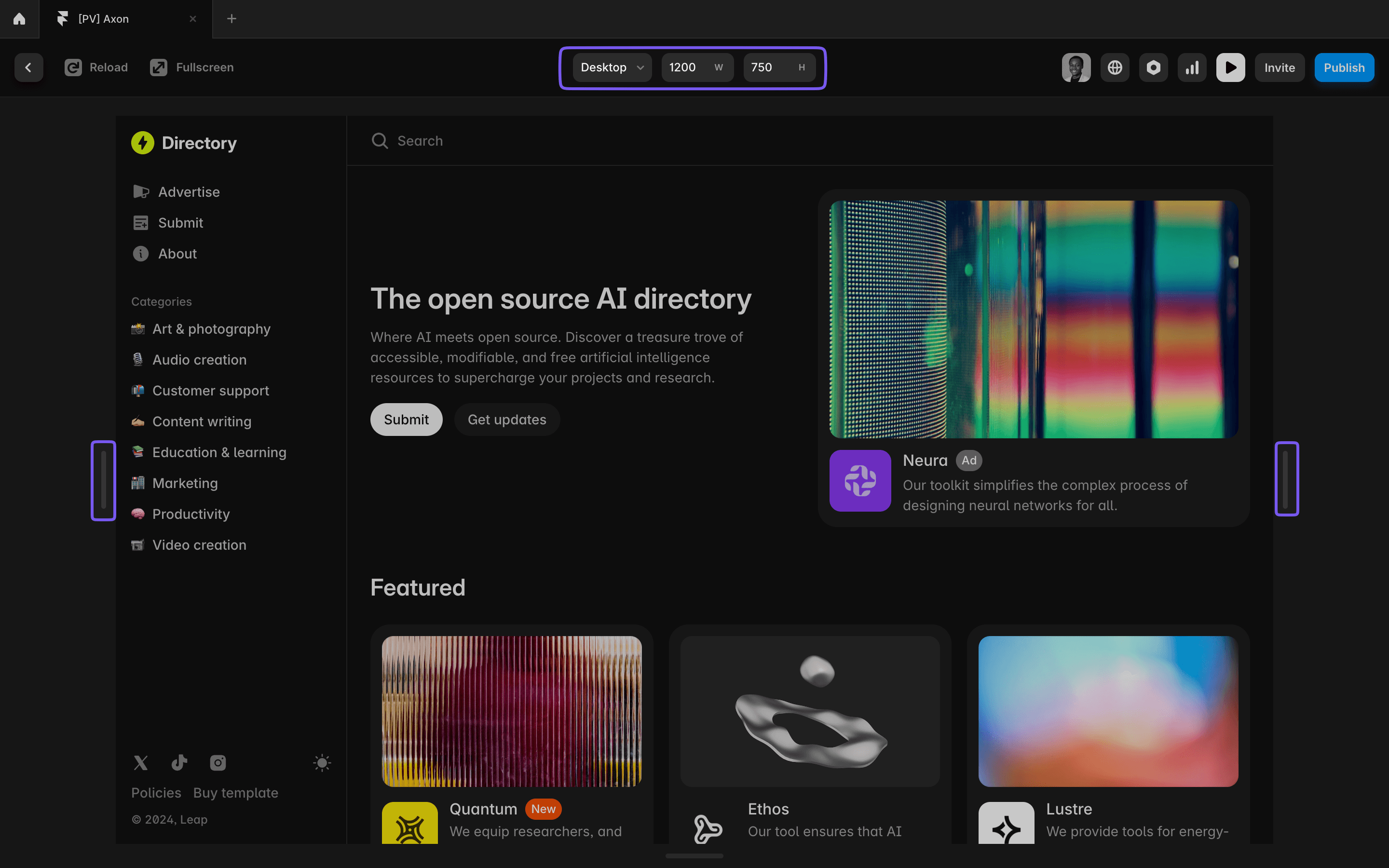
Test Your Responsive Design
Testing is crucial to ensure your design works as expected across various devices. Framer provides built-in tools to help you preview your design at different screen sizes.
- Preview Mode: Drag the handles to see how your layout changes at different breakpoints.
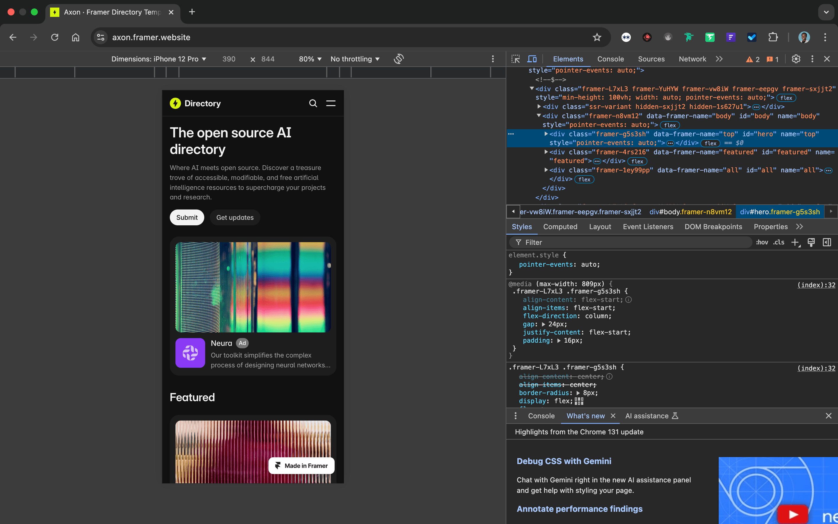
- Browser Developer Tools: For more thorough testing, use Chrome’s DevTools or similar tools to test your design on larger screens and specific devices.
Summary of Tips for Building Responsive Websites in Framer
- Use breakpoints to adjust layouts for desktop, tablet, and mobile.
- Changes cascade down from larger to smaller breakpoints.
- Start with Framer’s default breakpoints: 1200px, 810px, 390px.
- Stacks and Grids make layouts flexible for different screens.
- Avoid fixed dimensions — use relative sizing and constraints.
- Set responsive text styles for large, medium, and small screens.
- Optimize images by locking aspect ratios and using SVGs.
- Test your design with Preview Mode and Chrome DevTools.
Launch faster with premium Framer templates
Pick from our collection of sleek, professional Framer templates designed to get your startup online fast.
View all templates
Keep reading
Our blog answers the most common Framer questions with clear, step-by-step tutorials to help you succeed.
View more tutorials
Join the weekly newsletter and get 25% off
Subscribe for free to the newsletter, get weekly Framer tutorials and insights—straight to your inbox.
Join 1,200+ subscribers. One email per week, unsubscribe anytime.